Showing posts with label American Crafts Thickers. Show all posts

Friday, January 25, 2013

Custom Engagement Scrapbook- Getting Hitched in New York City

Hello there!

I can now reveal the pages I made for a client's engagement scrapbook last November.

I wanted to give plenty of time for Dan to pop the question to his girlfriend, Jess.

You are going to LOVE this story!

Dan had saved bits and bobs from dates and trips abroad with Jess for over 9 years.

Now he wanted to pop the question by putting them in a custom scrapbook of their lives together.

Opening page- I used some Crate Paper Valentine's paper I had for a while.
I tried to keep things simple as possible since I knew many
eyes with different points of view would be looking at this book.
Dan met Jess on a band camp (BAND CAMP!!!!) trip in 2003 when they were both in High School.

They then attended George Washington University together (where they had great spots to see President Obama's first inauguration), and moved to New York City upon graduation.
Jess is a great photographer so Dan and I had plenty of material to choose from.
We decided 2 page spreads built around specific themes would be the best way to incorporate
everything. For this high school themed layout, I used the pops of red and blue in the photos
 to guide my journaling sticker choices and picked a dark color to match the next page.
High School Prom was very important to Dan. He saved the tickets all these years.
I built a page around the ticket colors and used silver alphabet stickers to give the page some pop.
Fussy cut roses from defunct manufacturer Paper Truck made their way into the page.
 I loved the look so much I made myself a page using the left over flowers.
 When I think of college my brain immediately goes to blue jeans and notebooks
so I used those prints as the main elements for this part of the spread. The blue
jeans paper is Bo Bunny and the notebook paper from a Me and My Big Ideas print.
This page went over HUGE with Dan. I was so excited because I really loved it too.
Prints from My Mind's Eye and Studio Calico were used to make the rays.
The stars were made with EK Success squeeze punches.
 Basic Grey chipboard alphas finished the page.
The book also had to have several pages detailing their favorite activities together and a special spread for their families who would naturally want to share the book.

The 2 page family spread turned into my favorite. I love the bright pops of red and you can't fail with tile letter stickers and grid patterns.
I really hadn't used my collection of stickers before this project.
Now that I had a specific audience I suddenly understood how to use them properly.
So there's a tip: if you're out of ideas, choose someone specific to design for  and make the page
in a way you think would please them. You'll be surprised how much you'll love the page.
I stuck to high quality materials for this project- Crate Paper pagers, letter stickers from American
Crafts, Elle Studio and Ormolu mini journaling cards, October Afternoon journaling stickers and
embellishments from Studio Calico. I also reinforced everything with Zip Dry glue since
I've had letter stickers fall right off the page just as I hand over a page more than once.
When in doubt- double the amount of glue in a project.
I had so much material to sort through I was actually worried I wouldn't be able to fit it all into 10 pages so the project expanded to 15, then, 17, pages. 

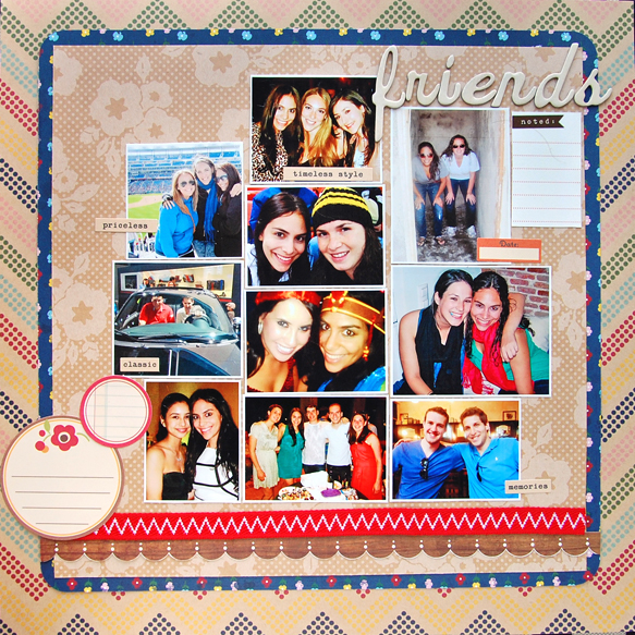
Next up are the rest of the themes Dan wanted covered: travel, city life, friends, sports and one page I love above all....

Dan saved 9 years of movie and broadway show tickets which we decided to make into a background for a page containing a tiny photo of the couple.

I've seen scrapbook paper with ticket themes before but never one made with actual tickets.
I matched pages in most of the 2 pages spreads but I associate travel with freedom and fun so
I just used a tiny amount of the green stripe paper on the orange page and brought orange to the green page with some My Mind's Eye enamel dots. 
These two have been EVERYWHERE! That map washi tape is AWESOME!
It brings to very different pages together perfectly. I wanted this book to look like
it had been put together over time so I didn't pick one collection or color scheme for it.
I love the look of matching books but I think they can look rather static and dated if they have
too many pages. Then again, sticking to a color palette and single pack of paper is more
economical- something to think about if you are putting a book together for someone. 
This city life page also worried me since the photos where from all over the place.
When I realized many of the photos had water in them a title popped right up and
the rest was easy. Journaling spots from Ormolu did most of the design work here.
Jess has a HUGE collection of Instagram photos- it was hard to pick just 6 for this layout but
I wanted to give the page some breathing room.  This was actually the first page I made and it still looks unfinished to me.
I showed Dan a stack of papers and his eyes crossed- too many choices! But he thought Jess
would really love this rainbow chevron print from Pebbles. I cut out a frame for the outside layer,
flipped to the b-side and layered navy flower print in between to get this super simple and fun page.
Personalized Baseball cards!!! HOW COOL! I love this page! Light blue
looks AMAZING with bright red and yellow. An arrow badge from A Flair For
Buttons on Etsy and actual baseball tickets finish this page.
Dan had football tickets, photos of baseball games and specifically mentioned the Dodgeball team
he joined with Jess. I was stumped! Do I make three additional pages? I decided to put
them all in one page and leave plenty of white space for  journal specifics like names,
dates and memories from each event.  
Awesome right? My husband and I are now saving all our tickets so I can do this
for my own book!
 I think I scared Dan a bit by tearing up and repeatedly expressing my enthusiasm and gratitude for being asked to be part of this project.

Designing for someone else can be risky- especially since design work can be so style specific- but I quickly got over any reservations by keeping things simple and choosing prints and colors almost everyone loves.

I recently got an email from Dan, Jen said yes (YAAAYYY!!) and was thrilled with the book.
I was so happy to hear they (and their extended family) liked the book.

They had so many cute couple shots! I saved them all up for this page and imagined Dan popping the question.
Jess you are one lucky lady to have such a thoughtful and romantic fella!
 Congratulations to the both of you!!!
Thank you SO MUCH Dan (and you too Jess!) for trusting me with your memorabilia and telling me your personal love story- that alone was worth the meeting!

MucHoS SmOoChEs!
Michelle


Monday, October 1, 2012

It's OCTOBER!!!!!! Time for a totally non traditional, totaly awesome True Xoxo Girls Challenge!

Hello scrap happy people!
It's October 1st.
I hope you have your kid's costumes ready.
Stores are only stocking the minimum holiday items this year due to the economy so it's either buy full price OR make it yourself.
Guess which one I chose?
YUP!
I'm buying one.
I can see myself happily making a costume.
I also see myself sitting in a Caribbean beach sipping an obscenely large frozen Margarita and reading a book.
Both are pure fantasy.
So off to the store I go.
Lola wants to be a T-Rex or a "ceratops".
I need to find a costume that says "I'm a T-REX!!!" but not "I'm a BOY!"

This month the True Xoxo chicks have quite a challenge set out for you.
Scrap your Halloween photos.
DO NOT use the traditional colors of orange and black.
I would add that you should try to restrain yourself from using up all your spider/monster/pumpkin/haunted house stash on the page as well.

I was SO EXCITED- S.O.  E.X.C.I.T.E.D- to be using my stash I forgot all about the actual challenge of it all so I made two pages.
Here's the first:
One of my ALL TIME favorite collections EVER- American Crafts Nightfall- orange, black and sky BLUE! LOVE it! Plus the alphas and black chalkboard stickers are so amazing! I some Martha Stewart paper stashed since 2009, Uni-ball white gel pen, orange vellum  and some Studio Calico veneer banners; I was good to go.
Also- A Flair For Buttons Vintage Halloween buttons- awesome!
Here's the one you'll see posted.
SO different from what I usually make but really I was just glad to stop over thinking and just use paper in this thing- sometimes breaking out the paint just makes me all jittery.
I finally uses the My Mind's Eye paper I bought a while ago- who can resist that Polaroid frame print? Alpha tiles, mini brads apple sticker from from American Crafts. Prima leaves and Diamond Stickles (my favorite kind).
My Mind's Eye gorgeous chipboard. LOVE diagonal stripes mixed up!
Amy Tangerine roller date stamp has the cutest saying.
Perfect for the tiny banners in this print.
I used grey chalk ink pad from Paper Source.
True Xoxo wants to see how you handle the challenge.
Swing by, leave some comment love and link up your project.
I can't wait to see what you made!

Michelle

Monday, April 2, 2012

Scrapliftin' FOOL!- A True Xoxo Girls Challenge

Ah the Scraplift.
That venerable tradition where you STEAL (OOPS! LIFT! I meant lift!) an admired scrapper's work and make it your own.
Some would say you should give credit where due.
Others reply "It's JUST PAPER AND GLUE!"
As usual, my opinion lies somewhere in the middle.

BEHOLD!!! The April True Xoxo Scraplift another team member design challenge!
I chose Kimmie Jaster's Pancakes page and used DCWV Snapshot for this.  My final scraplifted page didn't look like "me".  
I was so annoyed! I hit the side of the paper with my elbow by mistake and cue angel chorus- I had my page.
There are so many people working, so many sources for inspiration and so many similar themes, trends and pre-designed products, it's inevitable that eventually something you make takes after someone else's project you dug and stuffed away in your lizard hind brain.
And there it lay. Waiting to come out at some later point.

Kimmie's original page- sorry the photo is so small.
http://lostinadreamofjosh.blogspot.com/
I know because it's happened to me.
I've never been accused of copying (OMG that sounds SO 4th grade!) but I've seen replicas of "my" pages in other people's galleries that were made BEFORE mine was and my question has always been:
Where the heck did I get that idea from anyway? I've never seen this page before.... have I?
TUN TUN TUUUUUUUUUUN!

If the page was made AFTER mine I think:
Am I REALLY so awesome that this random person would "steal" from me?
And my lizard hind brain answers:
 "YEZZZZZ! YEZZZZ!!!! Zat izzz yourzzzzz!
BE HAPPY!!!"

Because I always have another ace up my sleeve. No, it's not an actual ace!
It's a state of mind.
That comic book word bubble deserved it's own page!
You will ALWAYS have more ideas and there will ALWAYS be more opportunities.
There is a giant sky-wide PIE of creativity so vast that there is plenty to share.
PLENTY TO SHARE.
So scrap lift away amigos!
If you mention me- awesome! I'll get over it if you don't.
Like this:
GET OVER IT CHELLS!

But not if you're a retailer.
If I saw one of my pages or photos on an advert I'd be hella PISSED.
(AC Moore recently grabbed some Easter projects they spotted on Pinterest, smashed them onto one of their sales flyers then tried to say it was ok because they were "just for inspiration")
Shame on you retailer! SHAME!
Don't you have a creative services department?
GET ONE!
Pay those crafty folks!!! They deserve it!
LOVING the white lines on black Polaroid!!!
This month's True Xoxo challenge is too juicy to ignore.
There are so many fantastic designers on the team and the styles differ so greatly it would be a SHAME to pass this chance up.
So swing on by and have FUN!
http://truexoxoscrapbooking.wordpress.com/2012/04/01/challenge-28-were-scraplifting-too/

OH! And before I forget! True Xoxo is also running a Blog Header design contest! It's a great way to showcase your work! After all, it's the first thing any visitor sees!
Swing by and check out the details!
http://truexoxoscrapbooking.wordpress.com/2012/03/24/blog-header-contest/

Neon- it's SO COOL!!!
MuChOs SmOoChEs!
Michelle

Wednesday, March 14, 2012

In the Pink with American Craft's Dear Lizzy Neopolitan Line

Gooood afternoon world!

You know what I don't like?
Feeling completely overwhelmed and only then realizing I don't know HALF the things I need to get my latest "goal" accomplished.
This week I need to buy a printer.
ACK! I'm falling over in exhaustion just thinking about it!

Happy place! Happy place!!! HAPPYYYYYY PLAAAACE!


That's my baby at 8 months old. That's her "pleeeease take me out this crib" face. Needless to say it worked every time.
Materials: American Crafts Dear Lizzy paper and stickers, Martha Stewart mini doily, Studio Calico exclusive Thickers, Pink Paislee hexagon chipboard, Crafter's Workshop chickenwire template. Gesso from my local art supply store-(the cheapest I could find!)  Diamond Stickles and Making Memories lace.
I REALLY need to catch up on my Project 365 but with the printer on the fritz I don't see how its going to happen.

Anyone have a good printer recommendation? I'd like one with a scanner and separate color ink cartridges. It'd be great if it didn't cost an arm and a leg to buy ink for it but I know that's asking too much.
Here are some detail shots:
I ripped the back cover off the Dear Lizzy sticker book- the water color print is so pretty.
The Dandelion wisp post-it note is from a Korean stationary store
here in NYC- it's closed now- WAAAH!
I came across a GREAT blog post a million years ago on adding a bar to your 4 by 4 Instagram photos so you can print them at your local photo-o-mat BUT (there's ALWAYS a but on the truly fabulous... which explains Jennifer Lopez by the way) you have to use a PhotoShop Action.

**********Insert "Home Alone" movie Aaaaaaaaa face here.**********

I really dislike getting involved with Photoshop.
It's why I love my crappy iTouch so much- I get lots of fun photo effects and avoid "loading" Photoshop actions.
I bet I know what you're thinking!
What IS a freaking Photoshop action Michelle? YEESH!
A Photoshop action is the automation of a series of steps taken when using Photoshop to get a desired effect on a photo.
Does that even make sense?
No, right?

 So there you have it- thanks Einny.

I've never been good with learning anything that requires more than 3 nit picky steps.
My brain just freezes and goes: Trrrrrrra LA LA LA LAAAAA.

It's why I avoid HTML, Math, French cooking- you know- useful, life enhancing, money earning things.
I'm not proud of it or anything- just acknowledging the problem (and moving on)

Here's the link to that printing action by the way- sorry to make you wait with baited breath and all.

And here is what I got accomplished this week full of so much NOTHING I got exactly NOTHING done.

blank space indicating nothing
LOVE. IT. when I let that happen.
PS have you seen "Never Ending Story"?
No?????? GO. SEE. IT!!!

Oh! And I really love the Dear Lizzy line. Really really. Yellow and pink together?? Water color details? LOVE!!!

GRATUITOUS TODDLER PHOTO!!!!
I have a talking dandelion I can call my own.
Let's talk printers mi gente! Rants, questions you want me to investigate- recommendations- whatever!
PS- rants especially appreciated- if they are funny I will be tweeting them- you have been warned. :)

MuChoS SmOoChES!
Michelle

Saturday, February 25, 2012

So I'm 38 years old. A Project 365 Post


This will not be a post where I whine on and on about being "old".
I love being 38 fabulous years old.
I'm happier and more self secure now than at 28.
28 was me running around trying to figure out how to jump start my career and how to afford the latest hand bag or shoes a la Carrie in Sex and the City.
38 year old me is like WOW! CHILL, YO! 
I'm a MOM! 
It STILL trips me out!
Because I get to share moments like this.
Mural by Joshua Abram  Howard
I love the lines I see developing on my smile. 
I've always had the frown lines- frowny face is my default setting.
When I was younger, guys on the subway would say (yell from a distance):
"Smile girl! You're beautiful!"
Actually, the guy who yelled that got a smile. 
The ones who said more obnoxious things got THE LOOK.
It's a cringe worthy look. 
I tried it on myself once... DAAAAUUUUUUMMM!!!
So yeah the smile lines are a good thing- the rabid bull dog look was getting tired.
This week has been busy so I haven't been able to scrap much of anything.
I did experiment with this:
Project Life page!
Materials:  Sassafras Lass Sunshine Broadcast paper (fave ever!),  Fiskars Jenny Bowlin
flying bird punch, Ormolu spot, Studio Calico wood veneer asterisk, Smash polka dot
tape, American Crafts Sunrise alphas (fave font ever!) Hambly chicken wire tranny.
So I saw a photo of the India Street Mural Project online and I simply HAD TO SHOOT IT!
I first thought this would be easy. It was but ONLY
if you pick paper with no border. Cutting this
12 by 12 into 7 by 9 and making the pattern MATCH
was hard. But the final results were great.
India street is about 20 blocks from where I live.
How. Had. I. Missed. It?
The murals went up in 2009.
Dave and The Lolster admire Chris Soria's mural.
I was 5 months pregnant and battling doctors who were telling me I should consider "termination" because my baby would most likely be severely disabled.
I gave 'em THE LOOK. I wore it for the next 2 months.
I just felt it was gonna be ok. I FELT it. 
And she was. And she IS.
First time I let you slide down by yourself. 2/22/12
So there it is. Why I'm so happy. Why every day is a gift. 
Why I'm so freakishly expressive (blabber mouth!).
Try not to totally hate my blubbering. 
I do hold back SOME of it. :)
Not THE LOOK. 
MuChoS SmOoChEs!

Saturday, February 11, 2012

Thank god it's... saturday?

OOPS! I was supposed to post this yesterday since I know most people are out doing fun things on Saturday.
I saw a BEAUTIFUL page on Scrapbook.com by Jolaine Frias and I simply HAD to lift it.
By "lift" I mean take an idea I loved in her layout and try it for myself. I wouldn't try to copy the whole layout- she's too fabulous- it would take WEEKS of learning new techniques.. now that I mention it- maybe I should go ahead and try it.

Here's my version:
We were just walking around the neighborhood when I started seeing all these awesome messages.  It was like the walls were telling me to CHILLAX- others are feeling it too. I used a mist tube taping technique I picked up while watching a Swissgirl Designs video- can't believe it took that long for me to "get it".
Materials: Bazzill paper, Crafter's Workshop brick wall 6 by 6 template, Prima brick stamp, American Crafts Rootbeer Thickers, Colorbok glitter arrows, Tattered Angels Sunflower, October Afternoon Buttermilk mist, Studio Calico Schoolhouse, Atmosphere and Calico White mists, Hero Arts alpha stamps, Red Stickles, Smash Polka Dot tape
What I loved about Jolaine's differently styled page (which is also up on her blog) is her gorgeous tone on tone brick stamping. It's a small detail in the layout but I really liked how controlled and thoughtful the design is. The pattern is placed in just the right places to add visual complexity to an already fabulous layout but without adding visual clutter- a trick I haven't quite gotten the hand of yet.

Here are a couple of close ups:
I love Lola's pose! I think these are too blurry- I took them in late afternoon light.
I'll have to reshoot this again but I was so excited I had  to share! I used a Crafter's
Workshop brick template I've had for over 6 months- why did I wait that long?
The alphas started as brown glitter. I added some red Stickles and I really like the effect.
The red gets depth from the brown underneath and the edges stay dark for extra pop.
I'll have to keep that in mind for my next Thicker alteration.
This page came together rather quickly after I printed the photos and penned the brick pattern. I see I'm getting a little more abstract in my work- a little more minimalist. I like this new direction- it feels authentic to me.

GRATUITOUS CUTE BABY SHOT!!!!
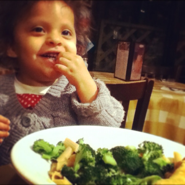
Lola likes Broccoli- a LOT! I will keep encouraging this wonderful eating habit-
it keeps me from raiding the potato chips.
MuChOs SmOoChEs!
Michelle

Thursday, December 29, 2011

Favorite Project of 2011!

I love these posts!!! I like reading other people's posts and I like trying to choose just 10 projects for mine. This year I went for 12- 1 for each month.

This made me feel so much better about my "talent". My love of graph prints is in full effect and obviously I will NEVER be a clean and simple scrapper- even though I strive to be so.

And so, in no particular order:
Sketchy Thursdays January  GDT application page- I was so sad to see I had missed the deadline to vote!
Voting challenges are hard for me because I hate asking people to vote- it seems so conceited- not that I
mind voting for my friends when asked which is kinda two faced right? ;)

This page came outta NOWHERE and firmly established Sunshine Broadcast as my favorite collection
ever- how I'll miss Sassy! It got picked up by several websites- it's time for me to start submitting for pub calls- if I can keep the due dates straight!
This is also from a Sketchy Thursdays sketch- love the radioactive quality the colors took on when
I shot the page in blue tinged shadow.
From a sketch provided by a website I no longer remember- this was so FUN and I really love that
I finally used my apple picking shots from 2010.
This was made way back in January of 2010- it's messy and much more genuine than some of the forced stuff I do now.
Favorite photo of my Mom- she looks so beautiful here. I'm excited about her next step- her upcoming retirement- wish I could buy her a trip to Australia as a present.
Studio Calico winner for second week of June- Vee left a comment and I almost died-
she's one of my FAVE artists ever along with Emily Pitts and Sasha Farina. FANGIRL!
This was for my DT application for Elle Studio- naturally I got nowhere as it's a little naive but
I love the girlie colors and the photo- my Lola was so vulnerable at this point.
I made this for this year's Paper Issues Blog hop- it's about the culling of Canada Geese in NYC parks- something I deeply disagree with. I made this page in 30 minutes!!!! I STILL can't believe it.
By the way- there's a great Numbers challenge up this week- swing by and check it out: http://paperissues.blogspot.com/2011/12/weve-got-your-number.html
A page for the True Xoxo Girls November challenge- love the clean design of this and Ormolu is SO AWESOME! When they have a DT call I am SO applying! Check us out! http://truexoxogirls.blogspot.com/
This was a page for Punky Scraps- I used a roller to get the mist to spread evenly- this was the first time I actually made a PUNKY page for them. Swing by and check out this month's latest challenge: http://punkyscraps.blogspot.com
This is my first Gauche Alchemy project. I write for their website so I no longer have much scrapping time but I love their funky products check out the BLOG and ARTFIRE STORE.
Before I forget- Carmina of PasigMom fame has asked that I tell you 10 THINGS ABOUT ME.
Here goes:
1. I used to be eat cherries by the pound but I'm now allergic to whatever they put in them to keep the bugs away- WAAAH!
2. I like writing this blog as much as I like actual crafting.
3. No white hair yet but I see the frown lines and wish I had the moolah to pull a Nicole Kidman.
4. I love Terry Pratchett, zombie novels and Batman comic books.
5. I can be annoying. I am aware of the problem and work on it constantly.
6. I love the colors red and pink together.
7. I'm a paper hoarder- wish I could say I wasn't- really.
8. I use scrapbooking as a way to develop my photo skills and technological knowledge.
9. I've made more friends and had more fun doing this than any other hobby I have ever taken up.
10. I like plants. (smiling)


MuChOs SmOoChEs!