Monday, March 11, 2013

WHAT I LEARNED THIS WEEK: Minimalist Design

Happy Monday folks!

Today's installment of what I learned this week is all about minimalism.
Well ok- not ALL about it-
just the part that pertains to scrapbook pages that take hours and hours and hourssss.

I've always been attracted to the stark and beautifully balanced look of Japanese art and interior design.

This style is more about visual harmony and quality materials than proving you are wealthy (or a really talented scrapbooker) by gilding everything.

You can also fall under the false impression that minimalist projects take less time.

Yeah, no.
Not if you take forever and EVER to choose items so that they contrast just enough to make the page pop but not enough to stab the viewer's eyes.
That last part is subjective.
Materials: Scrap FX Endless Beauty wordlet #2012036, Sakura Flowers #2013009 and
Magnolia branch #2013001, Coredinations Jenni Bowlin paper, October Afternoon chevron pattern paper, GCD Studios Sweet Surrender print paper, 
I started with the beautiful Sakura photo of the Brooklyn Botanical Garden.
This photo is AMAZING. I still can't believe I took it.

My camera has a panoramic setting but you can use an app called Picstitch to get that same look with your iPod or you can crop and print to photos and stick them down on your page for a really fun collage look.
What I learned

  • Without basic design knowledge you can easily spend hours shuffling an image around the page for "balance". 
Simple is not easy.
So I found this chart by Grant Snider of Incidental Comics
It helped. A LOT.

  • I've been using CoreDinations paper a LOT lately. I went to their blog to get technique tips and found out they are having a design team call. !!!!  I considered applying but a public blog post is required as your application. Right... 'nuff said on that.
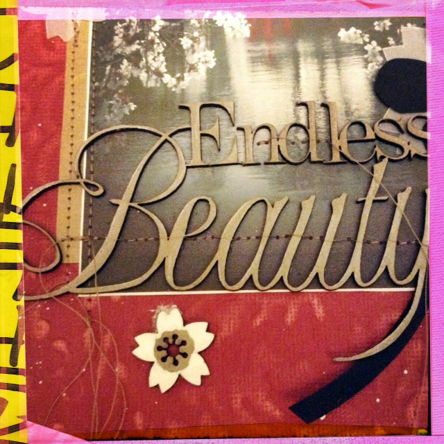
You can stitch through delicate wordlets!
Just use the hand knob to advance and bring up your foot so you don't stitch through the actual letters.
You can put it down again when you reach the border.
Hope I'm using the right terms for the parts there...
I'm reading Dina Wakely's Art Journal Freedom. You MUST pick it up!
She details the products she uses on her spectacular pages.
I picked up some acrylic artist ink which is super ka DUPER opaque
and the dropper means you get CRAZY awesome splatter.
Also? It fully covers chipboard in 1 coat!
 New finishing fave!
The larger Sakura is finished with Stabilo water color pencil and a bit of water to
smooth away pencil lines. The brighter white flowers were finished with artist ink.

  • Going by the chart above- I've already failed. The loose gold thread all over this page is hardly "clean".  I just learned the rules and I'm already having fun breaking them!
  • I also added hidden meaning (another no no- OOPS!) with some GCD Studios paper snippets so  you don't have to "search" for it in the page. You're welcome!
  • Sanding Core'Dinations paper is easier with a sanding sponge from your local hardware store. It's 2 dollars versus the 10 you'll pay for a fancy Tim Holtz scrapbook sanding block. 
  • I made vellum Sakura by tracing the chipboard and cutting them out. This was time consuming. I really love the look. I REALLY love it. I'll have to make a separate page just with those.
  • My scanner is still going strong. I can't believe I can get clear impressions even with the thick chipboard on this page! SO EXCITED!!! Now I can work AND shoot pages later at night!
Today marks 2 years since the Tsunami that killed over 19,000 people and displaced another 300,000 in Japan.
Sometimes my inner brain tells me things that my outer brain wants to ignore.
Let's all pause for the lives lost.
One of my favorite Williamsburg spots.
MuChOs SmOoChEs!
Michelle


Wednesday, March 6, 2013

WHAT I LEARNED THIS WEEK- Chalk Ink and Scrap FX stencil fun

Happy wednesday folks!
I was flying high on scrappy mojo last weekend and experimented with both my Scrap FX stencils and my Pima chalk inks.

Last week readers and fellow scrappers Scraps and Scarlett BOTH wrote in to repeat advice they had given me before:

When working with wet media it's best to use heavy weight paper and spray the paper down a bit before you start.

Ok advice taken.

Not really.

I decided to use chalk ink with my FABULOUS Scrap FX Engineering stencil because I didn't want to mess with mist spray.
Mists get everywhere and I wanted to work on a tv tray table while watching Sons of Anarchy.
(I'm totally addicted!)

I recently bought 2 pieces of luscious 8x11 double weight water color paper to play with.
I just love all the nooks and crannies!

I got to work and this is the resulting page:
I love everything. Tim Holtz grunge stamps, Prima's chalk inks AND  Basic Grey's crisp clean
Hello collection paper patterns. Who knew cleartitle were a blast from the scrappy past?
To me they are so fresh and interesting. Can you tell I only started scrapping in 2009
and have no friends to bug me with the latest "fashion. Scrapping should not be about fashion!
It should be about FUN.
Here how it went down step by step:

  • Prima Attic Dust chalk ink over Scrap FX stencil layer.
  • Gel pen outline since the ink got under the stencil and pooled all over the place.
  • 4 inch Tim Holtz subway poster stamp and black Prima ink.
  • PROBLEM!!! Chalk ink stamped image is not good on the uneven water color paper
  • White gesso layer to cover the ugly stamp
PROBLEM!!! Chalk ink is water based (water soluble)
so it streaked the gesso. DARN! MESS!
But wait... this is... pretty!!!
  • Spray the front and back of the page with Tattered Angels "Iridescent Gold" which I almost threw out because it's pretty much invisible. The thing is... that's a GOOD thing if you are layering multi media work. The gold added a nice sheen to the paper.
  • PROBLEM gray stencil ink started running down the page RED ALERT RED ALERT
  • Decided to use that as an effect and added some Studio Calico Opaque White spray mist to make the ink run even more.
  • Let dry for 30 minutes and try to distract myself. 
  • Try to speed things up with heating tool but that cracks the gesso- a look I hate and refuse to include in my pages.
  •  Emboss the Tim Holtz stamp in black.
PROBLEM- the bottom of the paper wasn't fully dry
so the embossing powder stuck at the bottom. But wait..
New York City subway- that texture IS PERFECT!!!
  • Decided this was a grungy page and went with it. FORCED myself to relax. It's. just. paper.
  • Chose gear and cog chipboard designs to go with the "Steampunk" look.
  • Added red circles from Basic Grey's "Hello!" line to give some contrast and focus to the page  
Plunked Clear Scraps title right on TOP of the photo and outlined
the edges in permanent ink so they stood out more.
The printed film strip chipboard is also from Basic Grey's Hello line.
shhh don't tell anyone- it's freaking FAB!
  • Called it a friggin day

Where did my "What I learned this week" logo go?
It got me nowhere so I decided to design something a little less chessy looking.

Hope you have a great day folks- off to work I go!

MuChOs SmOoChEs!
Michelle


Monday, March 4, 2013

What I learned this week: Stitching Letters


HELLO!
Welcome to my new blog series:
What I learned this week.

Do you like my five-second no Adobe Illustrator-experience-whatsoever series banner? (HA!)

Each Monday I'll talk about a new (to me) technique and all the mistakes I made during the process.

This week's technique was inspired by Sasha Farina's gorgeous stitched layouts for Studio Calico.
Candy colored vintage buttons, vellum paper "Bokeh" and my favorite Glitz line ever.
Materials: GLitz Design Color Me Happy papers, vintage buttons, Maya Road burlap heart and orange twine from Divine Twine.
I'm waiting for my Amy Tangerine letter stitch stencil to arrive.  (EXCITED!)
Till then, I'm using embroidery grid paper which is AWESOME... if you can draw.
This was a LOT harder than I thought but I've been promising to practice my penmanship for YEARS
so saturday night I put on Season 3 Sons Of Anarchy episodes on Netflix and got to work.
Since I was using thick twine (first mistake) many of the letters  required tape to
keep the twine in place.  

What I learned this week:
  1. Use thinner embroidery thread and smaller needle for detailed jobs like this. I used a huge upholstery needle- easy to find in my mess but hard to use without punching through the paper.
  2. Reinforce paper that has had string punch through with washi tape. 
  3. Twine is not the best option for paper but looks FANTASTIC on burlap details or sewn through button holes.
  4. The duo-tone twine blended right into the paper. Use a brighter or contrasting color for titles.
  5. Stick buttons down with Zip Dry BEFORE you stitch them on a page.
  6. Walk back and STARE at your layout BEFORE you stitch everything into place! 
  7. The location icon that is the main focus of this page has a wonky right side because I was working right over the page and never spotted that the buttons need a little more curve there. 

Could be better but it's my first time. Loved this- will be trying it again!
What did you do this weekend?
Also what crazy technique would you like me to try out?

Have a great week!
Michelle

Friday, March 1, 2013

TGIF!!! A Cityscape scrapbook page

Hello there!

I wanted to share a page I almost threw in the garbage this week.
With my track record that usually means everyone will like it.
Not fishing for compliment,
just admitting that I don't have all the answers (obviously! LOL!)

The new Crate Paper DIY Shop line has me DROOLING!
I combined it with a couple of older favorites from Jenni Bowlin.
The final effect seems dreary.

Let me know what you think ok?
My Leica is at the shop FINALLY getting cleaned (after 2 years of sticky buttons) so I shot this page with my husband's iPad. It's incredibly difficult to shoot straight with one of those plate-like things. I did my best.
Materials: Jenni Bowlin Tickets paper, Crate Paper stripes paper, CoreDinations Jenni Bowlin embossed paper,
A Flair For Buttons Project Life flair and arrows flair, Crafter's Workshop Urban Landscape stencil,
banners from Basic Grey and Maya Road, Prima Stamp Press and black chalk ink, Ranger black crackle paint,
Montana white paint marker (which turned green when I used it over the Ranger crackle paint. It wasn't dry yet)

How in the WORLD does Anna Maria Wolniak get all that water color paint on her pages without warping her paper????
Between the gesso and the uneven machine stitch my page is more of an S shape.
And that K & Co washi? 
Love the print but the darned thing can't lay down flat even with stitches AND Zip Dry holding it down.
Adding the buttons and the twine was a last minute idea.
I love how the final page looks finished without a lot of
my usual last minute fussy cutting of random elements.
My goal for 2013 year is to sharpen my technique skills.
I want to be able to cut a script word with my Cameo and stitch the center following the font.
I'm a LONG way from my goal! 
YEESH!
Then again, if  I were to throw this out for "mistakes" it would have lasted all of 5 minutes. 
Literally every step involved a screw up that I had to FORCE myself to overlook.
One thing I love about it is the diagonal border. 
I could do that to every single one of my pages and never have enough.
Also?
Buttons are RAD!!! On everything!

SPRING FEVER!!!! HA!
MuChOs SmOoChEs!
Michelle

Tuesday, February 26, 2013

SURPRISE!!! Scrap Fx blog hop WINNER! And fun with A Flair For Buttons badges!

Hello there!

Thank you so much for leaving all the amazing comments for the Scrap FX blog hop this weekend!

I found myself laughing out loud more than once as I read your comments.
While some of you can't get enough of dress forms, gears and butterflies, other are DEFINITELY over them.

Many of you love nature influenced designs and you REALLY love script font wordlets.

Those are my absolute favorite too (along with the mini packs- I love mini everything!)


I decided to pick a winner for myself.

I will send 6 new Scrap FX designs to:


CONGRATULATIONS!!!!

Em please email your addy along with your style preferences- my address is on the upper right of this blog.

This was my birthday weekend so I spent a lot of it running around visiting friends and shopping
but I made a page for the A Flair For Buttons blog:
Materials: A Flair For Buttons 2013 button (love the spray painted look of the font!)
American Crafts Charcoal cardstock, Cosmo Cricket printed chipboard, neon pink Duck tape,
Stickers from Crate Paper, Studio Calico white mist and neon pink mist from Stencil1.com
The Crafter's Workshop Microbial Stencil by Julie Balzer is an instant fave- so fun!
I used it to suggest snow and to give movement to a page that was pretty static.
The neon pink mist from stencil1 is also a new favorite.
I use it sparingly because it really is bright.
I was a little distressed by the mist going over the stencil edge but
I actually like that now. Duct tape is NOT acid free but I loved the texture it added to the page.
 I also wanted to use it- it's been hanging around for 2 years now.
Next, I'll cover stencil borders with it so they don't bleed.
An idea from a Creative Jump Start video by Julie Balzer .
I've been reorganizing my stash.
I shop too much and have a tiny space so it's been really stressful and messy but I'm slowly getting to the point where things are grouped together in a way that makes sense and makes them easier to find.

Any suggestions?


MuChOs SmOoChEs!
Michelle