Sunday, March 31, 2013

What I learned this week: Postal rates, Dubstep and Indigo color madness!

Hiya and happy HAPPY monday folks.

WHY is it happy?
'Cause it's FINALLY SPRING, yo!
Sweet!!!!

WHAT I LEARNED THIS WEEK:
Postal rates. (ARE BANANAS!)
I recently posted a package to the UK.
UPS wanted 115 dollars (not a typo) to send it "express".
Never mind I didn't NEED express service.

The US Postal Service wanted 16 dollars for 10 day delivery.
Ok! I can swing 16 dollars.
But there is no tracking on the package.
ie: they can dunk the box in the Thames.

I'm all for paying fair price for services but, dude, you have to do your job.
If I send something I expect it oh I don't know.. ARRIVE.
It WOULD be nice if it arrived without it looking like someone went Dubstep on it.
What? Never heard of Dead Mau5?
Yeah me neither, but this Dubstep gif is AWESOME!
I first heard of "Dubstep" from my nephew who loves this music so
much he write status poems about it on Facebook.
Not EVEN kidding.
ANYWAY.
I did manage to get some pages done.
Indigo blue is IN.
Here's a great reference story Design Sponge: Current Obsession 
What I started with Bockingford 140 lb water color paper  in grey.
The paint splatters went completely wrong and I loved it.
Dave thinks this looks like Jimi Hendrix looking up into the sky.
I bought the Liqitex on clearance this week at Michael's for 99 cents.
I've had the Tattered Angels in my stash for over 2 years.
They are on clearance in a lot of stores.
I resisted to urge to buy more even thought I love it.

  1. Crate Paper's "On Trend" collection has a lot of indigo, emerald and grey- all are "hot" right now. Try not to kill me for combining trends and mixed media art- it's the scrapbooker in me.
  2. Tattered Angels mist in Sapphire is really watery so it starts wonderfully dark and gets nice and sparkly towards the end of a drip. I used the tip of my paint brush to spread the paint out when it splattered in the "wrong" area.
  3. Liquitex soft body paint is great for mixing and it goes on real smooth on chipboard.
  4. Tattered Angels "Glimmer Glam" in Blue Suede Shoes. The cap has a brush built-in so you can paint, splatter and wash with abandon. The glitter gets a little annoying- wish it were smaller grained.

Now I'm seeing Indigo everywhere!
This is a neighbor's front door.
Have a great week!
Michelle

Friday, March 29, 2013

Inspiration Friday- Brooklyn Botanical Garden (and an art journal page)


Hello!

This week has run right past me laughing!
I barely had time to notice all the beautiful things so I could share them with you here.

Last night I was trolling Pinterest again.
I'm trying to figure out how to organize my boards since I have so many.
How do you pin?
How do you categorize it?

Here is a very quick page I came up with on the theme "summer heat/ summer sun"
Can you tell I'm SO over this lingering winter weather?
Don't ask my why I combined Tattered Angels "Frozen Lake" with Cosmo Crickets Twenty Three
collection paper and grey water color paper- it just "felt" right.
 The stencil set is from Michael's- 5 bucks and AWESOME!
I also scored on metallic Faber-Castell gelatos at TJ Maxx.
5 dollars for mixed media packs that included water color pencils and PITT pens.
We also visited the Brooklyn Botanical Garden which I put on my "flower watch" every year.
This year the trees have budded but none have flowered,
It will be a few more weeks before I get good Sakura photos.

I did take a couple of shots:
The Magnolias are still budding but the Chinese Camellia tree is in full bloom.
Many of our favorite trees have survived Hurricane Sandy. 
Tiny pine cones from the Japanese Pavilion.
Japanese Pavilion, Brooklyn Botanical Garden
First "winter" type shot I've ever taken.
I think I'm going to swing by and get a snow shot next year. 
Bonsai. It's amazing this tree is alive and thriving on a plate.
SO inspiring!
Sorry I cut the top off. 

Have a great weekend!
Michelle

Wednesday, March 27, 2013

Fun with neon washi tape!

I was perusing Pinterest yesterday and a bunch of JBS Design Team pages jumped out at me.

Apparently the March Papercrafting kit includes a B side print that looks like it was covered in yellowing masking tape.

Then I saw this page by Amanda Jones and immediately ran to my scrap desk.
This was the result.
I used the sun from the Scrap FX  travel embellishment pack model #2012190
and the urban stencil model # 2012348
This didn't require a lot of my prized, out-of-production MT neon pink washi tape.
I mixed in a few of my other pink tapes to give the page a little texture.

I got this materials photo idea from Yvonne Yam who also has a
GREAT tutorial over on her blog Do More With Less.
I used the following apps for this: Hipstamatic, PicTapGo for the dreamy
 exposure, Camera+ for the border and Phonto for the words.
I also used a tiny bit of Zing! neon yellow embossing powder.
I still have their old version which is more mustard than neon and I rarely use it.
This new one is bright and very pretty.

Funny thing about neon- it's really hard to photograph.
The scanner couldn't handle this page at all- it made everything almost white.
A few weeks ago I was asked to participate in Noelle Hyman's Paperclipping Roundtable.

My nervousness got the best of me and I spent more time telling rambling stories than discussing the subject at hand- challenges in everyday scrapbooking.

I now have an answer for Noelle's very perplexing question-
How to scrap everyday moments if your routine stays the same or if your family spends a lot of time in front of a computer?
Used with permission- sort of.  ;)
One of my answers clearly should have been: "follow" your family members and take a screen shot when they post something funny, cute or memorable.

Thanks for swinging by!
Michelle

Monday, March 25, 2013

What I "re"learned this week! Project Life is FUN!

Good Monday Morning folks,

Over the weekend I had several amazing conversations with people I deeply admire.
I spent so much time talking I didn't really have time to scrap.


Now it looks like I'm about to embark in one of the most exciting periods of my life.
Some friends and I have formed a group called

"The Mariposa Creative Collective"

Basically a monthly meeting where we hold each other accountable for our creative goals- whatever they may be.
  • If you are a New York City scrapper or creative type send me a PM via Facebook and will add you to the group. I plan to post thought provoking articles and our meeting notes there for everyone to discuss in between face to face meetings. 
  • If you have a small business you are trying to get off the ground send me a PM and we can consider you as a guest speaker. Any entrepreneurial activity is fine. Creativity is boundless.
We meet once a month and discuss our goals for the month.
We hear a speaker and have a hen session about what's current and creative ways people have found to make money- it's a GREAT way to get inspired and get CRACK-A-LACKING!

It's exiting because, for once, I feel like I have feedback on this crazy journey I'm on.
It will help me focus and perhaps stop all the internalized negativity creating alone can encourage.

I did manage to finish my first 2 Project Life spreads for 2013 this week.

I have sneaks because the pages will be going up over at the Scrap FX blog tomorrow and I want them to get full "splash" effect.
Need a quick finish option for naked chipboard?
WASHI TAPE, BABY! Just trim the edges after you stick it onto the design.
Scrap FX has a whole new design team.
I'd love for you to swing by and check out what they bring to the table.

Scrap FX newsprint frame finished with Prima chalk ink in "Attic Dust" grey.
Prima chalk inks quickly cover chipboard- primer isn't needed.
What I learned:
  • The most important thing a creative person needs, other than supplies, is SUPPORT. 

  • I can't say this enough! Put the love out there first. Really. Love and compassion first.
    Judgement and anger have their place but you only get what you put out.
  • Punching the corners out of your PL inserts is a drama all on it's own.
DON'T use this punch. Are you laughing at the photo?
Switching from large to small corners in one
 punch is a great idea! But this design lacks a "window" so you
 can see where your corner end up before punching- BIG problem.
 That shape isn't consistent either- you can't "mess up" on PURPOSE.
Fiskars has a GREAT customer service department but they can't fix
bad product design. Consider me schooled.
PS- I still love Fiskars and buy all their other products.
Me and this punch? Enemies!
  • From a fellow "Lifer" came the thunder striking idea to just take my journaling cards with me wherever I go. Write down what I feel when I feel it. The photos can stand on their own.
It's totally out of focus but I love my genuine smile.. and my hair.
LOL!
Thanks for your continued support of this blog!
I love that you swung by!
Michelle


Friday, March 22, 2013

Friday Inspiration- Photo App Discovery!


Hello!

Thank you to my Scrap FX teamie Sparkling Gnome for letting me in on the coolest app yet- Lenslight.

I've had a week to play around with PicTapGo (another photo app) and have decided it rocks!
It's so easy to lighten or brighten photos on this app!

Michelle's top five all time favorite Apps:
1. Hipstamatic- for it's "Jane" lens and it's "Big Up" film that has yellow, pink or black borders.
All the photos below were originally taken with Hipstamatic and processed in another app.

2. Instagram- for sharing (I actually don't like IG filters at all- most are too dark)
I took this image during that magical time when the evening light turns gold.
The photo was enhanced using my new fave app- Lenslight.

3. PicTapGo- for fast and easy (and controllable) image editing.
This photo used to have bright pink borders from my Hipstamatic app.
The "Montecito" filter made it all dreamy and over exposed.

4. Lenslight- for funky light effects you can fade or change color.
I've been looking for a way to add "rainbow" washes on my photos for a while now.

There are "Bokeh" effects in many different shapes- they can be shifted around the screen and the color can be changed- pretty versatile- it has one major problem though-
the filters all degrade your already pretty low smart phone photos. Use sparingly.
5. PicFX for Bokeh you can layer.
This filter REALLY degrades imagine quality.
Keep that in mind when using it especially if you are
thinking of submitting your project for publication.
Magazines like to see clean and very crisp images.

My scrap space organization project is still under way.
I've been buying mists for 4 years now.
I used to keep items in different spots so it was easy to lose track of how much crap I have.
Then I ran out of space.
Ikea Rikka picture ledges to the rescue!
Estimated count: 28 bottles a shelf- 3 shelves= 84 bottles!!
Shock and awe!!! Many of these are still new and unused!!!
I had them in the bottom of an organizer and forgot they were there.
Hoard much?
Yet there is an explanation.
New colors come out every 6 months.
Simply buying each new color from 3 different manufacturers- Studio Calico, Tattered Angels and Ranger gets you these many bottles in 2 years.
I haven't bought any of the Tattered Angels chalk colors I want.
And now I CAN'T.
Because it's very clear- I bought too much already and need to use it.

New York City Manholes!!!
I've taken over 30 images of these the last couple of days.
I love their awesome radial patterns!
MuChOs SmOoChEs!
Michelle


Wednesday, March 20, 2013

Scraplift challenge! 1 hour "lucky" scrapbook page

Hello there!
I've decided to move my scrapbook "hot topics" post to sundays.
I suspect most of my readers don't want wordy posts on wednesdays.
If you feel otherwise please feel free to leave a comment!

Today I want to share a 1 hour project I made for the True Xoxo Scrapbook Challenge Blog.
I've been scrapping with these gals since the group formed in 2010.
I stick around because group leader, Lindsay, comes up with THE BEST challenge ideas!

Here's my page:
Materials: Studio Calico "Darling Dear" paper, Glitz filmstrip transparency (which comes with those
awesome mini windows! LOVE!), Heidi Swapp Teal mist, Sassafras Lass woodgrain alphas
and red alphas from Joann's. Teal tape from Target.
Xoxo has two scrap lift challenges a month.
The way it works is you swing by and pick a page to lift. Then link the page up.
Simple!
The winner of each month gets a GDT spot on the team which is nice since we get to chat.

The only family photo in front of a fantastic sunburst mural that is gone now.
Dave and Lola were complaining mightily so
all I got was this one photo. I find Lola co-operates with smiles more if she
sees what is happening in the camera- which makes sense, actually.
The March mid-month challenge theme was "lucky" in honor of Saint Patrick's Day.

By PURE luck, I picked out a paper that had a teal title on it and some washi tape to match.
The scanner turned the teal green and I decided that was also a good thing.

The film strip comes from the AWESOME Glitz Design "Color Me Happy" collection which is one of my favorites this year.

What's this? Swing by the A Flair For Buttons Blog and read all about it!
(Please and thank you!)
Swing by True Xoxo and join the challenge.

Thanks for swinging by!
Michelle


Monday, March 18, 2013

What I learned this week- Scrap FX orchid stencil MADNESS

Hallo folks!
This week I was all about the procrastinating!
Delayed the cooking.
Delayed the cleaning.
Delayed the scrapping.
Everything on my to do lists got put on hold!
Why?
I'm tired and "thoughtful" bloggin is HARD yo!

This post alone? 2 hours!
Between the writing, the copy editing and the photo uploading- blogging is time consuming.
Not complaining- just saying- content= life hours= expensive.
Life hours- the most valuable thing we rent.

New header! Better? I'll have to go hunting for "learning" photos.
This post almost didn't get written.
But I made a promise to myself I would learn and put the learning into action this year- not just coast by on scrappy shopping binges.
(More on THAT this wednesday for the Hot Topic post)

Last week I used the Scrap FX engineering stencil and got some funky effects using chalk and Tattered Angels Gold mist.

This was the FABULOUS background result:

Why not try it again? This time with this gorgeous flower stencil?

Scrap FX orchid stencil item #2013031
I didn't take photos of my experiment this week. Why?
I forgot!
Mostly because this page happened over a couple of days- I was experimenting with different kinds of white ink.


What I learned:

  1. I don't like Heidy Swapp Color Magic resist paper. Too unpredictable. I have a whole pack so I will give it another try but so far? IXNAY.
  2. Check and DOUBLE check your paper strips before you sew them down- invariably they are crooked. Invariably when you think you are fixing one, it's the other that's wonky.
  3. People REALLY like all white pages. Like as in LOVE- as in you can throw up all your white items on the page and STILL get 50 likes from your IG followers on it. I'll never understand that- color is so wonderful.
  4. Prima Attic Dust chalk ink is awesome. AWESOME.
  5. Most white acrylic ink will not show on misted paper. I should write up a whole POST on all the white ink I've tried to use. I JUST realized my white paint markers are OIL based DOH!!! That may explain why they don't work over acrylic. Back to the drawing board I go.
  6. I ruined several .2 Micron pens by using them over mist paint backgrounds. 3 dollar pens! So obviously there needs to be more investigation into that. Back to Dina Wakely's Art Journal Freedom I go.
Sorry this week's post is wack.
I promise to take photos for next week's post.
Yellow and purple- not a bad color combo...
maybe I'll try to "rescue" this page as well.
Those Crafter's Workshop cameras will have to get the boot though.
Hope you have a GREAT week!
Michelle


Friday, March 15, 2013

Friday Inspiration- NYC photo walk-about

Hiya!

Yesterday was my day off.
Naturally I had a TON of errands to run so even though the day was freezing I decided to walk around and visit some of my favorite mural spots to see if anything new was up.

So. GLAD. I. did!!!

Here is what I found most inspiring this week:

BAST at Soho- not sure if the artist defaced his/her own mural- this was hella cool.
If you listen- the walls speak.
Ryan Russo's "Out Of Context" at the Charles Bank Gallery.
Acrylic spray paint and newspaper collage on canvas.
Meanwhile over at Nolita... (Kenmare and Bowery)
Crash AKA John Matos over at Bowery Mural
Also? POPEYE!!! TOO AWESOME!
Abandoned building across from
The New Museum has some of the best old school poster graffiti.
These are all letters cut out of ads.
Must go back and shoot this one again!
Detail of Ryan Russo piece- canvas was 8 x 8 feet.
Newsprint, paper, photographs- collage- amazing.
Layered oblong hexagon vellum over at the Anthropologie store window.


I freaking LOVE New York!
Michelle

Wednesday, March 13, 2013

HOT TOPIC Wednesday! Scraplifting. Also? FUN SCRAPPY NEWS

Hello dear readers!
Thank you for swinging by today!
I'm going to give picture headings another try. This is my try at "hot topic"- the hearts are red.
Yeah I know.  I had to try!

Hot Topic will now be my wednesday post theme.

I love to talk and have opinions about everything.
Rather than shying away from this personality quirk (disorder) I have decided to embrace it.
Please feel free to tell me I'm fulla beans.
I like feisty people who tell it like it is.

This week I want to talk about (mini drum roll) scrap lifting.
"Hardly a hot topic!" You declare.
Well how about this- I think scraplifting is awesome.

Why Scraplifting ROCKS

  • All beginners start by imitating the work of other artists. Even Pablo Picasso. Even Rembrandt. If they can do it, so can you! Nothing separates one creative pursuit from another except intention. 
  • Scraplifting allows you to make pages you like from the word go.
  • Scraplifting teaches you about good design practices.
  • Scraplifting gives you a way to share with artists / crafters you admire. This last part is key.
I don't own a crafting business, sell classes or design products (YET- ha!) so my viewpoint might change when I have a financial stake on this issue.

But Not Always- Lifting isn't stealing
There's a difference between imitating an admired project and posting your version in your personal blog/gallery and selling someone else's technique, original pattern design or tutorial as your own.
I cry foul on that. 

What if someone copied a project of mine right down to the same paper and title and posted it with no credit?
Personally, I'd be glad someone noticed my work and I'd leave comments to encourage that person to keep going. 
Give people the benefit of the doubt! It's FREE- like politeness or smiling.

Maybe they forgot the source of inspiration. 
Maybe they have no clue that giving credit is a cool thing to do- that's not "common sense".
I didn't do it when I first started out!
But really- does it matter?


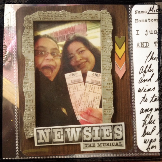
I posted this page a few weeks back but I'm putting it up again because it
was lifted by Mia of MyCreativeLife.blogspot.com. Mia's page is coming up next. 
You are FULL of ideas! Your brain = Mary Poppins' carpet bag!

I know I have MANY more original ideas in my brain pan.
"Copy cats" (ie: people of excellent taste) can catch up but they can never pull ahead- they have to wait for my next move after all.
But what if they DO pull ahead?
What if "they" get published? Get the DT spot I wanted?
Or spark up a rad new product deal with fill-in-the-blank scrap company?
Then they are doing something right!
Watch them and learn. They aren't merely copying.


Scraplifting gives you a way to share with artists / crafters you admire but haven't met yet.
Sharing is good.
Share the credit- give shout outs to people- even the "big" scrap personalities like to hear that their readers are paying attention.
Don't just say "Love this!" 
Tell them why or how it reminds you of a particular story you'd like to share.
Make the page and change things up a bit-
improvise and leave a link on their blog comments section.
Call them out on Twitter.
"Share" their links on Facebook.
Before long you'll have a mutual appreciation going.
And THAT is what scrapping "public" should be all about!


Mia's version uses her favorite colors- bright pink and soft blue.  I suspected she would like my page when I posted it because it looks a lot like HER work. Check out her blog My Creative Life.  See what's happening?
We feed off each other- this is a GOOD THING.
It's why scrapbooking and blogging about it works so well-
you grow as  crafter and you see how your work influences others.
Speaking of which, I have a couple of shout outs to share:

Special HIYA! and Thank You! to Ashley Oliver AKA Soaphousemama of PurpleMailbox.
Soapy has my back and I love her for that! 
Also? She's freaking amazing. Swing by her blog and check it out!

I also want to thank Margrethe Aas Johnsen of OneLifeDocumented
Margrethe's work over at Scrapbook.com got me to stop trying to imitate the Prima design team and start making original work.
If you want a lesson in disciplined and modern scrapbooking swing by her blog.


All the opportunities that have landed on my plate lately are due to friends who read this blog.
THAT'S why you leave love, give credit, stay positive and be true to you.
It comes back.
Times five.

DOH! Before I forget!!!    BREAKING NEWS!
I participated in this week's Paper Clipping Roundtable, a free scrapbook podcast available through iTunes.
I was FLABBERGASTED when I heard they wanted to talk to me.
Me? Random chick with a blog that isn't connected anywhere else?
COOOL!
Fellow guests Tracy Banks and Lain Ehmann blew my mind with their poise and great ideas.
Hosts Noell Hyman and husband Izzy are so genuine and funny! 
They made me feel welcome and valued- I talked like a mad woman as usual but they handled it.

Swing by and check that out- better yet- subscribe! 
It's free and it's fun to hear people talk about scrapping once a week.


MuChOs SmOoChEs- the paper kind!
Michelle