Showing posts with label what I learned this week. Show all posts

Tuesday, May 7, 2013

What I Learned This Week- Thoughts on the concept of "abundance"

Hello!
This will be a long post but please bear with me- it's been building up for well over 3 months.

The last couple of weeks have been hectic but not due to my schedule.
I've had plenty of time to play with paper.
I bought lots of stuff to work with (part of my problem- no really- a problem).
I've pinned many beautiful pages onto my already brimming full Pinterest boards.

I haven't made any actual work.
I'm not sure why this happens but it's regular as clockwork.
For every three pages or so, I need a week of rest.
I tend to freak out then because I have deadlines to meet.
Not working for a week means I now have to cut into blogging time or family time to catch up.

I see many other scrappers working every night or what seems like every other night- many pages are made- all different and pretty.
Why doesn't that happen with me?

I can easily spend 5 hours on one page.
Much of it sitting there trying to figure out why it's not "working".
I then think about all the other things I could be doing- cleaning, reading, running around with my family and I lose all interest.
Or worst- I sit down and hate every single thing I make- everything.
Like this:
So many mistakes in this page. So. Many. Mistakes! But after a few hours I can honestly say I like it.
This was my work on May 5, 2013. And soon I'll be somewhere else.
I have several ways to get out of a negative thoughts rut:

  • Cleaning. "Cleaning" is really shifting things from one part of the room to another. I haven't found an effective solution to this problem other than throw everything out. Considering the insane amounts of money involved that isn't going to happen. Obviously there is something about this hobby that sparks the addictive part of my personality. Maybe it's the positive feedback. Perhaps it's the community and the competition to get noticed. Combine those with the easy availability of new products and you get addiction. I spend more time writing and responding to social media than I actually spend making pages. I shop to feel better and in control. But with every purchase I get further away from control and empowerment. No savings, an increasingly crowded home environment, family members who wonder out loud how much is "enough". It hurts my productivity because I am frozen by the mess I live in. Paralysis. This is the first time I ever admit that in print. 
  • Get on the computer and try to leave love in as many people's work as I can. This can take hours and isn't really effective because it's usually "Gorgeous", "Amazing", "Fantastic". It's not really connecting with anyone in a meaningful way. People want and deserve real comments- real insights. I can't make them- I over scheduled myself and have too many things I need to get done just to keep in place- forget making gains on any particular relationship.
  • Go outside and shoot some photos. I take the family and it's great but any great outing takes all day and all my energy. I'm usually too tired to sit up another 3 hours shifting paper bits around for a blog post. I start to wonder- why do I do this?
  • I watch videos on new techniques or take notes on what I see in my past work that I want to try again. This is actually the most effective thing I've done this week. One video that helped was a"Glitter Girl" adventure where Shimelle picks a specific amount of papers and embellishments and makes three basic scrapbook pages. Here was a solution to my problem! The answer isn't more shopping and more choice- the answer is to pre kit and to stick with your choices till some work is made. So I did.

Another answer to "Why am I not more prolific?" came to me in the April meeting of the Mariposa Collective.
This is my group of creative entrepreneurial types who meet once a month to talk about our latest creative goals and dilemmas.

A fellow member brought up the subject of having a "mindset of abundance".
I've heard versions of this idea before.
I call bullcrap.

I believe my friend. I can see the positive effects from her change in outlook.
Her energy is way up and she's finding solutions to all kinds of problems big and small.
She is in a state of general and fairly constant happiness.

Obviously something about the "abundance" theory that's true.

I call bull patootie on the part of "abundance" mentality which is actually magical thinking.
If it's really true that "all you need to do is put out to the universe that you need x,y,z to get it", why are so many people starving?
This isn't me on a dramatic hyperbole streak- it's a genuine question.
Were they too busy being hungry to think positive thoughts?

Are we to blame starvation on the starved?

I find the idea incredibly offensive and deluded.
So I dismiss the conversation when I hear people start.

By doing that I miss out on a key point- ideas that could lead to a break in my paralysis.
Answers to why I need to "shop till I drop"and why I go on the computer for hours rather than start a new project- even though I genuinely enjoy the process of making things.

I start to think about the "abundance mindset" without the obnoxious magical thinking aspect.

It's clear that most successful entrepreneurs are relentlessly positive.
They have to be- if not they would give up.
Giving up is the failure.

Current culture is really against mistakes.
You cannot make them.
You cannot make them more than once.
Bullcrap!
Make the mistakes.
Then make the amends.
It's going to be ok.
So the water color I was using didn't look to good.
Neither did the hand written journaling I added.
I covered them both up with two older failed experiments.
Just. keep. swimming.

Entrepreneurial minded people assume that if they leap, there will be ground to land on.
Perhaps the assumption is "the ground will be green with grass and there will be plenty of cushiony flowers."
This is dangerous.
The best thinkers are ready for variables (rocks, thorny bushes, a rusty roller skate)
They are ready for a possible broken ankle.
But the point is to LEAP.
Eventually to LAND.
Sometimes there is a major crash or maybe just a stinging friction burn. 
A positive outlook helps with that too- it keeps you TRYING.
A positive outlook also keeps you flexible.
So you landed in Duluth not in Chicago.
Get going where you are.

So this week I pushed through layers and LAYERS of self imposed negativity and made one page.
Not a symphony or a painting or a cosy sweater.
Not a cure for the common cold or the latest tech gadget that earns billions.
Not a financial product that earns trillions for a corporation based out of New Hampshire.
A scrapbook page.
For this tiny blog with 275 readers (thanks guys)
A rock thrown in a pool to make waves in my own private fight with self doubt.
To prove a point.

We are all struggling through issues.
Self doubt, work or family stress, financial insecurity, a broken boiler, car transmission trouble, bad health.

For me having a mindset of abundance means accepting that I don't DESERVE anything in particular.
Everything is fought for, compromised with, chosen.
If I "miss out" on something- it will come back again.

I chose Lola over fear.
I chose life against all odds, against all medical advice.
Against the pressure of family members I love.
I said NO. She's here NOW. I love her NOW.
My pregnancy was only 4 months along and there were no guarantees it
would last to 5.
I chose from a mindset of abundance.
When the doctor said you can always have another one (Oh yes she sure effing did!)
I said, I have one now.
I asked what the baby's sex was and I was told it was a girl.
I imagined a curly topped mini me. I saw her.
The pessimist in me insisted it was going to turn out very badly.
But I chose optimism. I chose hope.
I chose to see myself as a capable and strong Mom to a severely handicapped child.
And here's the magic part. The part that's making me weep right now.
I became her.
I got lucky that the baby was fine. But I passed the test of fear.
I chose from abundance!
Why did I forget?
I constantly forget.
I scrapbook to keep reminding myself.
I made and keep making all sorts of life changing and people alienating errors.
But this one certainly turned out well.
I CHOOSE to be happy or unhappy.
I CHOOSE to be messy, ineffective and unfocused or I CHOOSE to be organized and productive.
I choose to feel guilty and like I'm a waste of space.
OR
I choose to forgive myself and move on.
I choose to see my work as the great happiness of my life or as the mad waste of time others think it is.
Perhaps I messed up by saying exactly the wrong thing at the wrong time to the wrong person.
Perhaps I let a deadline pass because I was too busy feeling angry or tired or overwhelmed.

But ABUNDANCE means- I get another chance.
I can try again.
There are always second chances.
I can say "I'm sorry".
I can say "Dude- you stole my idea! " or more likely "DUDE! This idea SUCKS! I spent two hours on this?"
Guess what? I have another idea. (And another. And ANOTHER!)

I just have to be open to the variables.
I have to be flexible.
I have to be people and relationship focused.
The answers are there but not if I let fear and self loathing cloud my outlook.
Fear and anxiety block creativity.
Which is why I only make 3 or 4 pages every few weeks,
I'm a roiling ball of anxiety and doubt.
I will stop the second guessing and move on.
I post this page knowing it's not the best thing I've ever made.
But it's not the worst. Not remotely.
It just is.
Another point in a long line of work.
Work I enjoy and which will eventually lead to my gainful employment.
If I
Just
Let
Go

If this is what's meant by "A mindset of abundance"
Then I can SO get with that!

Have a great day people.
It's gonna be ok- promise.

Michelle


Sunday, March 31, 2013

What I learned this week: Postal rates, Dubstep and Indigo color madness!

Hiya and happy HAPPY monday folks.

WHY is it happy?
'Cause it's FINALLY SPRING, yo!
Sweet!!!!

WHAT I LEARNED THIS WEEK:
Postal rates. (ARE BANANAS!)
I recently posted a package to the UK.
UPS wanted 115 dollars (not a typo) to send it "express".
Never mind I didn't NEED express service.

The US Postal Service wanted 16 dollars for 10 day delivery.
Ok! I can swing 16 dollars.
But there is no tracking on the package.
ie: they can dunk the box in the Thames.

I'm all for paying fair price for services but, dude, you have to do your job.
If I send something I expect it oh I don't know.. ARRIVE.
It WOULD be nice if it arrived without it looking like someone went Dubstep on it.
What? Never heard of Dead Mau5?
Yeah me neither, but this Dubstep gif is AWESOME!
I first heard of "Dubstep" from my nephew who loves this music so
much he write status poems about it on Facebook.
Not EVEN kidding.
ANYWAY.
I did manage to get some pages done.
Indigo blue is IN.
Here's a great reference story Design Sponge: Current Obsession 
What I started with Bockingford 140 lb water color paper  in grey.
The paint splatters went completely wrong and I loved it.
Dave thinks this looks like Jimi Hendrix looking up into the sky.
I bought the Liqitex on clearance this week at Michael's for 99 cents.
I've had the Tattered Angels in my stash for over 2 years.
They are on clearance in a lot of stores.
I resisted to urge to buy more even thought I love it.

  1. Crate Paper's "On Trend" collection has a lot of indigo, emerald and grey- all are "hot" right now. Try not to kill me for combining trends and mixed media art- it's the scrapbooker in me.
  2. Tattered Angels mist in Sapphire is really watery so it starts wonderfully dark and gets nice and sparkly towards the end of a drip. I used the tip of my paint brush to spread the paint out when it splattered in the "wrong" area.
  3. Liquitex soft body paint is great for mixing and it goes on real smooth on chipboard.
  4. Tattered Angels "Glimmer Glam" in Blue Suede Shoes. The cap has a brush built-in so you can paint, splatter and wash with abandon. The glitter gets a little annoying- wish it were smaller grained.

Now I'm seeing Indigo everywhere!
This is a neighbor's front door.
Have a great week!
Michelle

Monday, March 25, 2013

What I "re"learned this week! Project Life is FUN!

Good Monday Morning folks,

Over the weekend I had several amazing conversations with people I deeply admire.
I spent so much time talking I didn't really have time to scrap.


Now it looks like I'm about to embark in one of the most exciting periods of my life.
Some friends and I have formed a group called

"The Mariposa Creative Collective"

Basically a monthly meeting where we hold each other accountable for our creative goals- whatever they may be.
  • If you are a New York City scrapper or creative type send me a PM via Facebook and will add you to the group. I plan to post thought provoking articles and our meeting notes there for everyone to discuss in between face to face meetings. 
  • If you have a small business you are trying to get off the ground send me a PM and we can consider you as a guest speaker. Any entrepreneurial activity is fine. Creativity is boundless.
We meet once a month and discuss our goals for the month.
We hear a speaker and have a hen session about what's current and creative ways people have found to make money- it's a GREAT way to get inspired and get CRACK-A-LACKING!

It's exiting because, for once, I feel like I have feedback on this crazy journey I'm on.
It will help me focus and perhaps stop all the internalized negativity creating alone can encourage.

I did manage to finish my first 2 Project Life spreads for 2013 this week.

I have sneaks because the pages will be going up over at the Scrap FX blog tomorrow and I want them to get full "splash" effect.
Need a quick finish option for naked chipboard?
WASHI TAPE, BABY! Just trim the edges after you stick it onto the design.
Scrap FX has a whole new design team.
I'd love for you to swing by and check out what they bring to the table.

Scrap FX newsprint frame finished with Prima chalk ink in "Attic Dust" grey.
Prima chalk inks quickly cover chipboard- primer isn't needed.
What I learned:
  • The most important thing a creative person needs, other than supplies, is SUPPORT. 

  • I can't say this enough! Put the love out there first. Really. Love and compassion first.
    Judgement and anger have their place but you only get what you put out.
  • Punching the corners out of your PL inserts is a drama all on it's own.
DON'T use this punch. Are you laughing at the photo?
Switching from large to small corners in one
 punch is a great idea! But this design lacks a "window" so you
 can see where your corner end up before punching- BIG problem.
 That shape isn't consistent either- you can't "mess up" on PURPOSE.
Fiskars has a GREAT customer service department but they can't fix
bad product design. Consider me schooled.
PS- I still love Fiskars and buy all their other products.
Me and this punch? Enemies!
  • From a fellow "Lifer" came the thunder striking idea to just take my journaling cards with me wherever I go. Write down what I feel when I feel it. The photos can stand on their own.
It's totally out of focus but I love my genuine smile.. and my hair.
LOL!
Thanks for your continued support of this blog!
I love that you swung by!
Michelle


Monday, March 18, 2013

What I learned this week- Scrap FX orchid stencil MADNESS

Hallo folks!
This week I was all about the procrastinating!
Delayed the cooking.
Delayed the cleaning.
Delayed the scrapping.
Everything on my to do lists got put on hold!
Why?
I'm tired and "thoughtful" bloggin is HARD yo!

This post alone? 2 hours!
Between the writing, the copy editing and the photo uploading- blogging is time consuming.
Not complaining- just saying- content= life hours= expensive.
Life hours- the most valuable thing we rent.

New header! Better? I'll have to go hunting for "learning" photos.
This post almost didn't get written.
But I made a promise to myself I would learn and put the learning into action this year- not just coast by on scrappy shopping binges.
(More on THAT this wednesday for the Hot Topic post)

Last week I used the Scrap FX engineering stencil and got some funky effects using chalk and Tattered Angels Gold mist.

This was the FABULOUS background result:

Why not try it again? This time with this gorgeous flower stencil?

Scrap FX orchid stencil item #2013031
I didn't take photos of my experiment this week. Why?
I forgot!
Mostly because this page happened over a couple of days- I was experimenting with different kinds of white ink.


What I learned:

  1. I don't like Heidy Swapp Color Magic resist paper. Too unpredictable. I have a whole pack so I will give it another try but so far? IXNAY.
  2. Check and DOUBLE check your paper strips before you sew them down- invariably they are crooked. Invariably when you think you are fixing one, it's the other that's wonky.
  3. People REALLY like all white pages. Like as in LOVE- as in you can throw up all your white items on the page and STILL get 50 likes from your IG followers on it. I'll never understand that- color is so wonderful.
  4. Prima Attic Dust chalk ink is awesome. AWESOME.
  5. Most white acrylic ink will not show on misted paper. I should write up a whole POST on all the white ink I've tried to use. I JUST realized my white paint markers are OIL based DOH!!! That may explain why they don't work over acrylic. Back to the drawing board I go.
  6. I ruined several .2 Micron pens by using them over mist paint backgrounds. 3 dollar pens! So obviously there needs to be more investigation into that. Back to Dina Wakely's Art Journal Freedom I go.
Sorry this week's post is wack.
I promise to take photos for next week's post.
Yellow and purple- not a bad color combo...
maybe I'll try to "rescue" this page as well.
Those Crafter's Workshop cameras will have to get the boot though.
Hope you have a GREAT week!
Michelle


Monday, March 11, 2013

WHAT I LEARNED THIS WEEK: Minimalist Design

Happy Monday folks!

Today's installment of what I learned this week is all about minimalism.
Well ok- not ALL about it-
just the part that pertains to scrapbook pages that take hours and hours and hourssss.

I've always been attracted to the stark and beautifully balanced look of Japanese art and interior design.

This style is more about visual harmony and quality materials than proving you are wealthy (or a really talented scrapbooker) by gilding everything.

You can also fall under the false impression that minimalist projects take less time.

Yeah, no.
Not if you take forever and EVER to choose items so that they contrast just enough to make the page pop but not enough to stab the viewer's eyes.
That last part is subjective.
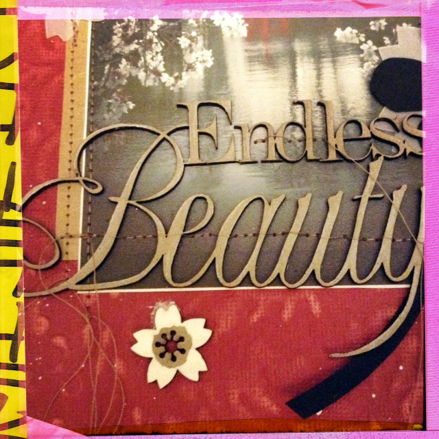
Materials: Scrap FX Endless Beauty wordlet #2012036, Sakura Flowers #2013009 and
Magnolia branch #2013001, Coredinations Jenni Bowlin paper, October Afternoon chevron pattern paper, GCD Studios Sweet Surrender print paper, 
I started with the beautiful Sakura photo of the Brooklyn Botanical Garden.
This photo is AMAZING. I still can't believe I took it.

My camera has a panoramic setting but you can use an app called Picstitch to get that same look with your iPod or you can crop and print to photos and stick them down on your page for a really fun collage look.
What I learned

  • Without basic design knowledge you can easily spend hours shuffling an image around the page for "balance". 
Simple is not easy.
So I found this chart by Grant Snider of Incidental Comics
It helped. A LOT.

  • I've been using CoreDinations paper a LOT lately. I went to their blog to get technique tips and found out they are having a design team call. !!!!  I considered applying but a public blog post is required as your application. Right... 'nuff said on that.

You can stitch through delicate wordlets!
Just use the hand knob to advance and bring up your foot so you don't stitch through the actual letters.
You can put it down again when you reach the border.
Hope I'm using the right terms for the parts there...
I'm reading Dina Wakely's Art Journal Freedom. You MUST pick it up!
She details the products she uses on her spectacular pages.
I picked up some acrylic artist ink which is super ka DUPER opaque
and the dropper means you get CRAZY awesome splatter.
Also? It fully covers chipboard in 1 coat!
 New finishing fave!
The larger Sakura is finished with Stabilo water color pencil and a bit of water to
smooth away pencil lines. The brighter white flowers were finished with artist ink.

  • Going by the chart above- I've already failed. The loose gold thread all over this page is hardly "clean".  I just learned the rules and I'm already having fun breaking them!
  • I also added hidden meaning (another no no- OOPS!) with some GCD Studios paper snippets so  you don't have to "search" for it in the page. You're welcome!
  • Sanding Core'Dinations paper is easier with a sanding sponge from your local hardware store. It's 2 dollars versus the 10 you'll pay for a fancy Tim Holtz scrapbook sanding block. 
  • I made vellum Sakura by tracing the chipboard and cutting them out. This was time consuming. I really love the look. I REALLY love it. I'll have to make a separate page just with those.
  • My scanner is still going strong. I can't believe I can get clear impressions even with the thick chipboard on this page! SO EXCITED!!! Now I can work AND shoot pages later at night!
Today marks 2 years since the Tsunami that killed over 19,000 people and displaced another 300,000 in Japan.
Sometimes my inner brain tells me things that my outer brain wants to ignore.
Let's all pause for the lives lost.
One of my favorite Williamsburg spots.
MuChOs SmOoChEs!
Michelle


Wednesday, March 6, 2013

WHAT I LEARNED THIS WEEK- Chalk Ink and Scrap FX stencil fun

Happy wednesday folks!
I was flying high on scrappy mojo last weekend and experimented with both my Scrap FX stencils and my Pima chalk inks.

Last week readers and fellow scrappers Scraps and Scarlett BOTH wrote in to repeat advice they had given me before:

When working with wet media it's best to use heavy weight paper and spray the paper down a bit before you start.

Ok advice taken.

Not really.

I decided to use chalk ink with my FABULOUS Scrap FX Engineering stencil because I didn't want to mess with mist spray.
Mists get everywhere and I wanted to work on a tv tray table while watching Sons of Anarchy.
(I'm totally addicted!)

I recently bought 2 pieces of luscious 8x11 double weight water color paper to play with.
I just love all the nooks and crannies!

I got to work and this is the resulting page:
I love everything. Tim Holtz grunge stamps, Prima's chalk inks AND  Basic Grey's crisp clean
Hello collection paper patterns. Who knew cleartitle were a blast from the scrappy past?
To me they are so fresh and interesting. Can you tell I only started scrapping in 2009
and have no friends to bug me with the latest "fashion. Scrapping should not be about fashion!
It should be about FUN.
Here how it went down step by step:

  • Prima Attic Dust chalk ink over Scrap FX stencil layer.
  • Gel pen outline since the ink got under the stencil and pooled all over the place.
  • 4 inch Tim Holtz subway poster stamp and black Prima ink.
  • PROBLEM!!! Chalk ink stamped image is not good on the uneven water color paper
  • White gesso layer to cover the ugly stamp
PROBLEM!!! Chalk ink is water based (water soluble)
so it streaked the gesso. DARN! MESS!
But wait... this is... pretty!!!
  • Spray the front and back of the page with Tattered Angels "Iridescent Gold" which I almost threw out because it's pretty much invisible. The thing is... that's a GOOD thing if you are layering multi media work. The gold added a nice sheen to the paper.
  • PROBLEM gray stencil ink started running down the page RED ALERT RED ALERT
  • Decided to use that as an effect and added some Studio Calico Opaque White spray mist to make the ink run even more.
  • Let dry for 30 minutes and try to distract myself. 
  • Try to speed things up with heating tool but that cracks the gesso- a look I hate and refuse to include in my pages.
  •  Emboss the Tim Holtz stamp in black.
PROBLEM- the bottom of the paper wasn't fully dry
so the embossing powder stuck at the bottom. But wait..
New York City subway- that texture IS PERFECT!!!
  • Decided this was a grungy page and went with it. FORCED myself to relax. It's. just. paper.
  • Chose gear and cog chipboard designs to go with the "Steampunk" look.
  • Added red circles from Basic Grey's "Hello!" line to give some contrast and focus to the page  
Plunked Clear Scraps title right on TOP of the photo and outlined
the edges in permanent ink so they stood out more.
The printed film strip chipboard is also from Basic Grey's Hello line.
shhh don't tell anyone- it's freaking FAB!
  • Called it a friggin day

Where did my "What I learned this week" logo go?
It got me nowhere so I decided to design something a little less chessy looking.

Hope you have a great day folks- off to work I go!

MuChOs SmOoChEs!
Michelle


Monday, March 4, 2013

What I learned this week: Stitching Letters


HELLO!
Welcome to my new blog series:
What I learned this week.

Do you like my five-second no Adobe Illustrator-experience-whatsoever series banner? (HA!)

Each Monday I'll talk about a new (to me) technique and all the mistakes I made during the process.

This week's technique was inspired by Sasha Farina's gorgeous stitched layouts for Studio Calico.
Candy colored vintage buttons, vellum paper "Bokeh" and my favorite Glitz line ever.
Materials: GLitz Design Color Me Happy papers, vintage buttons, Maya Road burlap heart and orange twine from Divine Twine.
I'm waiting for my Amy Tangerine letter stitch stencil to arrive.  (EXCITED!)
Till then, I'm using embroidery grid paper which is AWESOME... if you can draw.
This was a LOT harder than I thought but I've been promising to practice my penmanship for YEARS
so saturday night I put on Season 3 Sons Of Anarchy episodes on Netflix and got to work.
Since I was using thick twine (first mistake) many of the letters  required tape to
keep the twine in place.  

What I learned this week:
  1. Use thinner embroidery thread and smaller needle for detailed jobs like this. I used a huge upholstery needle- easy to find in my mess but hard to use without punching through the paper.
  2. Reinforce paper that has had string punch through with washi tape. 
  3. Twine is not the best option for paper but looks FANTASTIC on burlap details or sewn through button holes.
  4. The duo-tone twine blended right into the paper. Use a brighter or contrasting color for titles.
  5. Stick buttons down with Zip Dry BEFORE you stitch them on a page.
  6. Walk back and STARE at your layout BEFORE you stitch everything into place! 
  7. The location icon that is the main focus of this page has a wonky right side because I was working right over the page and never spotted that the buttons need a little more curve there. 

Could be better but it's my first time. Loved this- will be trying it again!
What did you do this weekend?
Also what crazy technique would you like me to try out?

Have a great week!
Michelle