Friday, June 28, 2013

A remote post!!!


Hello from Salt Lake City!

I wrote a whole post and added a bunch of photos but forgot to hit save!
whoops

It's 103 degrees today!
Isn't that awesome? 
I feel baked.
My skin is literally cracking from the dry air and hard water.
But this is an adventure right?
(Say yes)

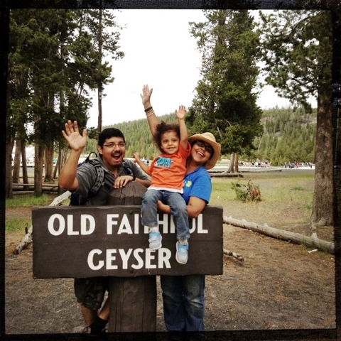
Last week I got to cross an item off my "bucket list" (that over used term finally applies to me)

Some pix: 


And:


Not to mention:

The nights at Yellowstone were FREEZING! 30 degrees!
Hello??? It's june!
But whatever,  it was awesome.

There are many more photos but they will have to wait until I figure out how to post lower resolution photos via my iTouch.
I hope this isn't slowing your browser down....

My first SLC scrapbook page:
Ooo I can't choose how big these photos will appear on the blog post... Or write proper captions! 

Feedback please.

I took the photo of this page using the "Afterlight" photo app so I could control the resolution (800x800 dpi) but for all I know it will look tiny compared to the monsters above that I uploaded using my iPod  photostream. They are the highest resolution available since I want to be able to print reasonably good looking photos.

I'm using the free blogger app- it's not very detailed and I can't seem to add links- bad for SEO...
Oh oh- none of my images are optimized either- no one will ever find this post!! GAH!!!

For my page I used:
Scrap FX pirate pack (compass)
 Scrap FX white tags
Scrap FX pointing fingers packI 
flair from A Flair For Buttons 
A FABULOUS new stencil from Natalie Kalbach's Stencil Girl line.
The chevron stamp is from a fantastic Etsy shop- DrumChickDesigns. 
The stamps are hand carved and mounted on thin wood for optimum storage and usability.
Love her shop!
(PS- II'm not affiliated with this business at all. I was impressed with the spectacular customer service and thought it should get props.)

I really hate not being able to add photo captions. This is Nat's background stencil. The 9x12 design is really easy to use. I like to include borders in my stencil play so this smaller size is fun for my style.

Let me know what you think about this post.
Did  it load quickly? 
Do you care about personal trip photos?

Did remote posting work?

Have a great weekend!!!
Michelle.

Saturday, June 15, 2013

Inspiration Elevator challenge- Then and Now

Hello!

Today Lola and I are flying away to a new life in Salt Lake City.
I already miss Brooklyn but I think this is just the kind of challenge I need.

This will be my last post for a few days.
I need to locate reliable internet service and set-up my brand spanking new computer- wooot!

On with the Inspiration Elevator challenge for June!


The purpose of this challenge group is to take our scrapbooking to the next level, to stretch our creative process and to grow as artists by embracing challenges that make us think, work and grow. You can view all of the challenges on my blog by clicking here or check our our new Inspiration Elevator Blog, here.

This month's challenge is issued by the super talented, Sue Sykes. Here's what she had to say in her very own words:

"I have all of my parents' photos stored at my place.  Shortly after I began scrapbooking,  my mom and I spent hours removing her photos from those dreadful magnetic albums and documenting dates on the back of them all.  So I will often sift through them and marvel at how much things change - and yet, they also seem to stay the same.

This month, I'd like to challenge you all to create a comparison layout or project - THEN and NOW.  It can be any topic; just document the parallels and differences between an event/person/place from the past and a modern likeness.  REMEMBER TO JOURNAL!! :)

Can't wait to see what you all create!"


I'm really sorry for the fussy photo. I may have to get my camera checked because
 it's really apparent that the focus is way off on this page.
I used Crate Paper and My Mind's Eye papers for this as well as ribbon from May Arts,
a Scrap FX ampersand, printed chipboard from Basic Grey,
Studio Calico Hot Dog mist to color the ampersand and vellum for the journaling. 
Coloring raw chipboard can be a challenge- I used gesso to tone
down the kraft color first then I covered with Prima ladybug ink but it didn't
look too great so I added a second layer of red orange mist paint.
Our Before journaling. I like that my daughter now has a page explaining how my husband and I met- it's something I've never covered before in a scrap page usually I just mess around with stuff and forget the story. Again- apologies for the terrible focus- I tried shooting this several times with no luck.

I have better photos of Dave and I from when we first met but I'm in the process of packing so I had to make do with images that were already in my "to scrap" pile.- This one actually really works because it's from our first visit to Salt Lake City in 2010 when we were just thinking about moving.
 I hope you will stop by and see what our designers on this adventure have created:

Have a great week!
Michelle

Wednesday, June 12, 2013

Change- on going for it. Also, my opinionated self is back.

I'm down to the last few days here in New York City.
On saturday I will be leaving for Salt Lake City with Miss Thang in tow.
We will be very happy to be reunited Dave.
Apparently there are many nasty storms coming this weekend?
I foresee fun times stuck at the airport with a crabby Lola.

We'll see if my residence is permanent in Salt Lake City.
I am tempted by the idea of having a backyard and a vegetable garden to worry over.
Perhaps if I can focus on my carrots I will stop being so neurotic over my scrapbook pages.
Can you grow carrots successfully in the SLC summer?
The climate seems rather severe- AHA! A challenge!

I will admit I have huge HUGE concerns about moving.
The first and foremost is diversity- of all kinds.

I am very comfortable in Brooklyn where if you swing a hoola-hoop you will hit someone from a random and fascinating part of the world you've always wanted to visit. 
And a young person who grew up in the midwest but is now running around wearing ironic 80's hair band t-shirts, ripped jeans, thick framed glasses and a mustache.

I'm not sure what I'm reacting to so negatively.
I've traveled lived in Oklahoma City, Detroit, Denver and even a tiny town in Texas where the movie theater was a 20 mile drive "into town".
I liked all those places.
Perhaps it's the reality that I will most likely not return to New York which is now the most expensive city in America.

Salt Lake City is beautiful and lively.. and COLD... and SNOWY... and spread out in all kinds of distressing ways which never include public transportation.
I will be trapped in the home we are staying until I learn to drive.
ACK!
The last time I visited there weren't any sidewalks because it was assumed everyone drove.
There is another place that does that.
LA.
I HATE LA.

It is my opinion that you are a true New Yorker if you do the following things:

  1. You know what a Egg Cream is and you take the subway to some random neighborhood in Brooklyn because "it's the best one around". You can substitute pupusa, canoli, bagel or curry goat for egg creams which are also popular in Baltimore and Philly.
  2. You've pushed hard to get into the crowded subway train car at 8:45am expecting to get to work on time. Actual physical distance of work to home be damned.
  3. You hate LA. 

Los Angeles is the anti- New York. 

A vast shinning wasteland of stuck-in-traffic cars, smarmy "agents" looking for the next rap video girl (this actually happened- I'll tell you about it someday- and yes- I declined), smog and people INSISTING they are happy because they sun sets there.
No one walks in LA unless it's in some strange gym machine that takes up half a room.

Life is best where you are happiest, where you feel most productive and centered.

It is my deeply held belief that I will be happy wherever Dave and Lola are.
Ok so there won't be decent pizza or Polish pastry available.
I think that might be ok too.
I can try to make my own right? (hanging question mark- we all know that ain't happening)

A scrap page:
Perhaps I wasted this gorgeous thick Crane's paper meant for
fancy wedding invites? It really would have taken press embossing well.
Materials: Scrap FX graphic circle and Playground alphabet set, A Flair For Buttons "yes!" button,
Sassafras Lass sticker, My Mind's Eye enamel dots, Webster's Pages triangle paper, My Mind's Eye pink
striped paper, My Mind's eye alphabet sticker sheet. Numbers stencil from Plaid. Yellow plastic
triangles from Freckled Fawn.
Layering doesn't have to be a million little things.
Here I created a grid background with a few sheets of
leftover sticker sheets. It goes alphabet sticker sheet,
journaling sticker, black paper to cover journaling lines that were distracting,
"Go for it" sticker from Jillibean Soup, Sassafras heart, title.
The trick is to try to choose items that have at least 1 color similar and
vary the edge shapes.
Stenciling things into the backgrounds also helps- if you make a
"mistake" it's easily covered by your layers.
A quick sneak peak of what's coming on saturday- Inspiration Elevator reveal day:
Dang it- I have to get a better shot.
The challenge is "Before and After" and you have to do a LOT of journaling.

Just as I leave, a new park opens- Bushwick Inlet Park
The views of the Empire State Building are INCREDIBLE-  check it out.


This was taken with my crappy ipod camera. Can you see the rain falling in the Bronx to the right?
 SEE MOM? TOLD YA! The weather is different borough to borough! We just had really cool waves.
This place is AMAZING.

Have a GREAT week everybody!
Michelle


Monday, June 10, 2013

Question- how do you crop and color correct layout photos without photoshop?

Hello Monday!

My posts may stop for a bit as I transition to new digs in Salt Lake City.
Writing won't be an issue but getting good photos of my projects without using photoshop is going to be a problem.

How do you crop your photos and color correct of you don't use photoshop?

I guess I could "stage" pages and shoot low rez in morning light.

If you have any tips on programs you use and love, please comment.

In any case I want to show you a page I'm crazy about:
MATERIALS: American Crafts cardstock, Graphic Circles model # 2013076, Lanky Upper Case Alphabet model # 2007011, Lanky lower case alphabet model #2007012, Basic Grey Fact and Fiction stickers, Plaid chalkboard paint, MT washi tape in red and red grid, Crate Paper bingo alphas, Studio Calico paper (strips), Studio Calico vellum
The lanky alphas are about 2 inches high so there is a
lot of surface area to play with. I wanted to go wild an crazy
with some geometric doodles but decided to stick with
something I've tried before. Not surprisingly they took
chalkboard paint really well so I'll have to use it again.
For the circle arrow I just used some washi tape and
a gel pen to make dots- so simple but so FUN.

I'm thinking of "joining the cloud" and using an online subscription service instead of filling up my computer with a bunch of programs.

The tech rumor I keep hearing from professional graphic artists is that owning software and having it take up space in your personal computer is slowly becoming a thing of the past.

I have my eye on Photoshop Elements- do you use it? Do you like it?
And also Lightroom. Do you use that?

I thought RADLAB was a subscription / cloud-based photo retouching program but it isn't. 

It's a photoshop plugin that allows you to add pretty non-destructive light and color effects to your images. Non destructive means you can reverse any changes made- something that cannot be said for images taken on the "Hipstamatic" or "Instagram" smart-phone apps.

College friend and fellow Mariposa, Saidy Lopez, and I went to Governor's Island on saturday to check out Figment
The cloud pavilion which was made with thousands of milk jugs.
Inside was quite the 70;'s funkadelic dance party.
Lola found many earthworms. And ate one.
Not sure who these dudes (and dudettes) were but they paraded around
we got picked up as Lola was wearing her T Rex costume.
It. was. awesome!

Saidy took this photo:
It was the end of the day. Lola was tired and refusing to smile.
I was suffering from extreme hat hair but STILL this photo ROCKS!!!!
That is what a good photographer can do for you.
Do not under estimate it.
This photo convinced me that 
a. I need to pick up my DSLR again
b. I need to start noticing things like f-stop and shutter speed again. I've been messing around for too long. For realz.

There is no photoshop trickery here- it's pure light and a photographer who stood her ground till BOOM she got the shot.


Have a GREAT week!
Michelle

Friday, June 7, 2013

Friday inspiration- Brooklyn Museum

Hark I hear the weekend call!

First order of the day- scrapbook!

I will put on "The Office" and watch season 8 all over again while drinking Brooklyn Lager.

I live literally 2 blocks from Brooklyn Brewery but have never gone to one of their famous tastings.

I am alone for the first time in months right now so I have to do all the things before Grandma brings the little one back.

Here are the things I found inspiring this week:
Brooklyn hand embroidered pillow cover on a FABULOUS chevron covered chair.
So there's a link right there for the museum shop.
It's 149 dollars- too rich for my blood but gorgeous right?
5 Points in Long Island City may be getting sold and leveled to
make way for more condos. If you're in New York take the 7 train and
swing by- it's worth it. 
These gorgeous machine stitched pillows are also
available but not on website. Sorry I didn't get the artist's name.
The Elizabeth Sackler Wing at the Brooklyn Museum has
an exhibit on quilting. It is my assertion that if quilts are
feminist statements of art so are scrapbook pages.
Discuss amongst yourselves.
Awesome diamond shapes at Urban Outfitters made with plywood
and light strips.
The El Anatsui exhibit at the Brooklyn Museum ws smaller than I expected but amazing.
He's got all kinds of interesting and theoretical things to say about why he makes giant
rusty metal or mixed media quilts. I just think they're awesome.
A new park has opened up next to East River State Park.
It's so pretty! And you can also play soccer in the new fields.
Love it!
And I got to meet Natalie K.
Who has a FAB new line of stencils with Stencil Girl Products. Woot!!!!
AAAAnd a sneak peek of two projects that will go up on the Scrap FX blog this sunday at 7pm (Monday 9am Aussie time.)


Have a GREAT weekend!
Michelle

Wednesday, June 5, 2013

In a New York State of Mind

I'm on a mad dash to do all the things I meant to do but never got around to.
All the things I would have done if I had seized days in New York City more often.

The Empire State Building steps that never got climbed,
the friends I rarely visited,
the walks I never took or the restaurants I never tried.
MATERIALS: A Flair For Buttons Brooklyn Bridge photo pin,
Crane's grey cardstock, alphabets from Jillibean Soup, October Afternoon and American Crafts.
Basic Grey wood veneer shapes, Webster's Pages yellow tape, Amy Tangerine yellow embroidery floss,
stripes washi from Red Lead online, Maya Road heart straight pin, My Mind's eye enamel dots, Studio Calico
felt bow, Colorbok craft stickers. Star stickers and vellum tag from American Crafts.
Now I desperately want to do it all and every day has more meaning.
Didn't I learn this lesson in school?
And again at all my previous places of employment?
The last day usually led to the most interesting and meaningful conversations.
It's not death, mayhem or disease- not remotely.
But it's a defeat realizing I didn't do what I wanted to do for a fear of failure.
Even worst?
Knowing I didn't start the custom items business or learn to sew like I always said I would because I got so busy doing other things.
Easier things.
Smaller things.
Details.
Routine.

I forgot to pursue the big things- the things that require planning- the things that lead to the higher rewards.
I put off taking risks, traveling, taking classes I knew I would love.
I told myself I had more time.
Materials: (Project Life Insert) Scrap FX love chipboard title
K and Co journaling pad paper, Crate paper vellum.
Enamel dots My Mind's Eye, Studio Calico wood heart.
I'm taking the time now.
I may be sad but that is a lesson too.
Take the risks- hop, jump, skip into the void.
Make room for plans and make the concerted effort to strive towards them.
Happen to things- don't let things happen.

I can be happy anywhere if I just remember those three simple things.


Have a great rest of the week.
Michelle


Monday, June 3, 2013

Let's Get Trendy Now- NEON

Happy monday folks!

Today I'm sharing my page for the Let's Get Trendy workshop.
The scrapbook trend I'm covering is a definite favorite- NEON! Woo hoooo!

There are other fantastic projects (including gorgeous cards and two sketches) on the Let's Get Trendy blog please swing by and check those out.

I love neon and I tend to go overboard when using it.
I make no apologies for this.
But it leads to pages that are certainly out there even for me.

I know the going wisdom is that you should use neon sparingly.
I've seen many gorgeous pages and cards made with just a hint- a touch - a zing- of neon.
I'm not part of that party.
I say slap it on, slather it all over and have fun with excess.
Viva the Las Vegas GLITZ of it all!
Materials: Paper Source Navy blue cardstock, MT pink washi tape, pricing stickers from the dollar store,
Sakura gelli roll pen in white, Crafter's Workshop pie chart stencil, vellum from Paper Source, Studio Calico
paper clip, Crate Paper tags, neon pink tag from Lawn Fawn, raindrop stencil from Scrap FX, Liquitex
neon pink acrylic spray paint, Mister Huey in black.
Neon items I highly recommend:
sequins
washi tapes (especially since they can be layered)
glitter (go. all. the. way!)
embroidery thread
chalk bistro markers (these are how Starbuck's gets perfect chalkboard menus)
stamp pads
acrylic paints- there are so many of these- you can go with high end Guache water color or a kid's set from Ikea

Two of my current favorites:
Sakura Gelli Roll and Souffle pens.
Souffle is so awesome- you get pure gorgeous neon PLUS a funky embossed effect. You can also use embossing powder on these because they dry slowly.
Molotow is a graffiti art brand.
These are paint marker refills with open droppers so you can either drip directly on the page or squeeze out and use a brush- the colors are pure energy- great for using on unfinished chipboard.  
Liquitex acrylic spray paint. Expensive and has a tendency to clog but still AWESOOOME!!!
Micheals' carries it.
It's usually locked in a cage to keep crafty teens from defacing the world with it. (snicker, snicker)
You can always layer over whatever bits you don't like.
Whenever something makes you uncomfortable I say WORK IT
Get out of that comfort zone!

You might just like swinging through the jungle growing outside.


Have a GREAT (colorful) week!
Michelle

Saturday, June 1, 2013

Get It scrapped CT Blog Hop


Welcome to e Get It Scrapped Creative Team blog hop!

Please help me welcome some new Get It Scrapped creative team members and say good bye to 
those leaving 
Here is the roster for 2013.
See anyone familiar?
I am honored to be part of the team this year- it's a thrill to be asked to be part of this highly inspiring and very supportive online community.

Each of the blogs you visit today features a scrapbook page inspired by each artist's favorite Get It Scrapped article.

We are also sharing a great opportunity to get issues of Masterful Scrapbook Design for a great discount- 60% off till June 3rd.

Here is a page inspired by my favorite article:

The Black and White photos article offers some very practical solutions to
dilemmas caused when trying to scrap older photos. I rarely match my photos to my scrapbook pages
but this photo of my German Shepherd Dixie has been sitting in my "to scrap" file for over 2 years.
I didn't want to scrap it with   pet themed scrapbooking supplies.
Printing the photo in black and white forced me to think differently.
If you like what you read in the b/w photos article I suggest you swing by Masterful Scrapbook Design and check out their issue covering photography.

 Just place the issue of Masterful Scrapbook Design below in your cart and apply the coupon code. 
In this issue of Masterful Scrapbook Design you will get extensive coverage on:
 best practices for shooting and selecting images
approaches to editing and cropping your images
new ways to think about photo placement for effective and eye catching layouts.
Use coupon code giscttsmh60p to grab this issue for 60% off through June 3rd.


Here is the full blog hop line up. 
Thank you for stopping by today!

Get It Scrapped 
Michelle Hernandez-  You are here YAY!!!
Celeste Smith

Have a GREAT weekend.
CARPE DIEM!!!

Michelle