Wednesday, February 29, 2012

Fun news! Ormolu reader feature

Just wanted top drop by and give a small toot that I'm featured over at the Ormolu blog today.
Yaaaaay!
I LOVE Ormolu products- they are the perfect small size, super bright and GREEN!


This page caught me completely by surprise.
I started by getting all Jackson Pollock on a piece of Jillibean Soup kraft paper and almost threw it out when I thought it looked to messy.
I starred at it for a while telling myself- SELF- YOU CAN'T THROW THIS OUT!! That paper was a DOLLAR.
I'm kinda strange.... But you knew that.
I then added the tone on tone Scrap FX chipboard which immediately focused the page and added the Studio Calico stamp on the bottom right to anchor the design.
The Sassafras Lass triangles went next to add some contrast to the chipboard and lastly I added the night photo, Ormolu "Super cool" tag and fabric flag on top to give it more pop.
The paint is watered down acrylic- the only thing that will show on kraft
I took apart an Amy Tangerine layered embellishment for the
"wish you were here".
When I was done I realized I was working with my lizard hind brain again- going forward with no real plan.
Very cool.
So thank you Ormolu- I got a lift on a rainy day!

GRATUITOUS CUTE TODDLER SHOT!!!
Learning to skip rocks.
MucHoS SmOoChEs!
Michelle

Tuesday, February 28, 2012

To redo or not, that is the question

If you are a frequent reader here you know two things
1. I talk too much. (Sorry)
2. I redo my work all the time.

I redo because I frequently get blank brain syndrome (made that up- Web MD can't help on that one) and have trouble coming up with new concepts but I'm REALLY good at spotting what's wrong with an older page.
So the redo is really an entry point for the next original project.

It's also a way to escape from the "I can't mess this up" loop.
If you frequently find yourself saying "I just have to get this right. I can't let these beautiful materials go to waste!"
Stop. You can always change things around. Use repositionable tape and let go.

Case in point:
Even lighting, more red to add contrast, a heart from the absolutely GORGEOUS  Prima wood veneer
collection and the addition of Jillibean Soup stickers- suddenly the page makes more sense.
You've seen me post this page at least 2 times before but only this time is it good enough to post.
I'm using Gauche Alchemy's Nearly Nekkid Mixed Media Paper Art.
I really liked the Jillibean Soup kraft cardstock alphas but I will admit to being a somewhat lazy scrapper. The amount of effort required to get these to look neat on a page is just too much for me sometimes so I scrawled my journaling in the nearest blank spot and called it a day.


I tried ignoring my mistake but when I hung the page up on my wall recently, I got a daily eyefull of personal scrap sloth and decided the evidence needed to go.

Easy-peasy redo. Ok not so easy- those darned itty bitty stickers
are nearly impossible to pull out their packaging without taking half
the other stickers out too so I use tweezers. EXCRUCIATING!!! But worth it.
Also- commas- I need one. 
Don't ignore the problem. Rise above it.
I'm speaking to myself most of all here.
another long week of no photos- a brief pause on my Project Life album but no worries, I will return for week 9.

What I'm working on RIGHT NOW:
Gauche Alchemy Knick Knack Paddy Whack kit.
I'll let you in on a secret: paint SCARES ME.
So this is killing me!!
Talk about WHAT IF I MESS IT UP? syndrome
MuChOs SmOoChEs!
Michelle


Saturday, February 25, 2012

So I'm 38 years old. A Project 365 Post


This will not be a post where I whine on and on about being "old".
I love being 38 fabulous years old.
I'm happier and more self secure now than at 28.
28 was me running around trying to figure out how to jump start my career and how to afford the latest hand bag or shoes a la Carrie in Sex and the City.
38 year old me is like WOW! CHILL, YO! 
I'm a MOM! 
It STILL trips me out!
Because I get to share moments like this.
Mural by Joshua Abram  Howard
I love the lines I see developing on my smile. 
I've always had the frown lines- frowny face is my default setting.
When I was younger, guys on the subway would say (yell from a distance):
"Smile girl! You're beautiful!"
Actually, the guy who yelled that got a smile. 
The ones who said more obnoxious things got THE LOOK.
It's a cringe worthy look. 
I tried it on myself once... DAAAAUUUUUUMMM!!!
So yeah the smile lines are a good thing- the rabid bull dog look was getting tired.
This week has been busy so I haven't been able to scrap much of anything.
I did experiment with this:
Project Life page!
Materials:  Sassafras Lass Sunshine Broadcast paper (fave ever!),  Fiskars Jenny Bowlin
flying bird punch, Ormolu spot, Studio Calico wood veneer asterisk, Smash polka dot
tape, American Crafts Sunrise alphas (fave font ever!) Hambly chicken wire tranny.
So I saw a photo of the India Street Mural Project online and I simply HAD TO SHOOT IT!
I first thought this would be easy. It was but ONLY
if you pick paper with no border. Cutting this
12 by 12 into 7 by 9 and making the pattern MATCH
was hard. But the final results were great.
India street is about 20 blocks from where I live.
How. Had. I. Missed. It?
The murals went up in 2009.
Dave and The Lolster admire Chris Soria's mural.
I was 5 months pregnant and battling doctors who were telling me I should consider "termination" because my baby would most likely be severely disabled.
I gave 'em THE LOOK. I wore it for the next 2 months.
I just felt it was gonna be ok. I FELT it. 
And she was. And she IS.
First time I let you slide down by yourself. 2/22/12
So there it is. Why I'm so happy. Why every day is a gift. 
Why I'm so freakishly expressive (blabber mouth!).
Try not to totally hate my blubbering. 
I do hold back SOME of it. :)
Not THE LOOK. 
MuChoS SmOoChEs!

Thursday, February 23, 2012

Scrap FX. RAD awesomeness- scrapified!

Scrap FX is having a design team call.
Their first ever.
This. is. monumental. Exclamation points. Many. Lots.
I love Scrap FX product. As in, I LOVE it.
I don't USE it.
I COLLECT it.
Like my Mom collects Lladro porcelain.
Like a jealous squirrel preparing for a long winter.
Have you ever gotten between a squirrel and her winter hoard?
It's not pretty.
Squirrels are TOUGH and they jump pretty far.
STOP LAUGHING.
A chittering squirrel advancing upon you in short barky hops is TERRIFYING.
You know it's giving you the old-school dress down.
Especially Manhattan squirrels- such SNOBS.
A. NY.WAY
5 projects are needed for the application.
This is my first:
You'll be able to see this page in the August 2012 issue of Scrapbook Trends Magazine
I've had that New York chippie in my stash since summer 2011. I bought it in Salt Lake City for 5 entire dollars.
Yes that's FIVE DOLLARS. FIVE! I loved it too much it had to be mine.
Materials: Scrap FX New York Chipboard,  Jillibean Soup Fresh Mushrooms paper,  Sassafras Lass In Retrospect paper (diamond stars), bicycle clip from World Wide Co, Studio Calico Awesome stamp, American Crafts Zing powder in black, Ormolu chevron fabric flag, tin pin and "cool" spot, Amy Tan hearts fabric strip and "wish you were here" sentiment, My Mind's Eye journaling card, white acrylic paint for splatters

I have weighed the ramifications stemming from an application for weeks.
Do I have the time to participate?
Do I have good ideas to to share and break out into tutorials?
Am I able to sell the product in my writing because I use it and love it so much?
Yes, yes, Oh HECK yes!
Am I awesome enough?
White acrylic paint watered down just a bit. All white colored
mist products just disappear into kraft card stock.
That last question is of most importance. I can't really answer it.
I have decided to just go ahead and throw my hat into the ring anyway.
Fingers crossed they will like my artsy urban Brooklyn girl style.
Things I love:
Insta frames, stamps,  iPod photos, the word awesome, woodgrain,
arrows, fabric embellishments, pop up elements and kraft paper. 
If you haven't heard of Scrap FX before, let me show you why I love them so much
(All product photos copyright Scrap FX).
These are my favorite products from the latest release:
Brick pattern good for mini book covers, misting to use
as a template or RAD city life themed projects!
Chicken Wire- I like to break these up and add them as layering to a page.
 Like here: (click on this link- please? smiley face)
I love all the different styles in this mini pack.
Great for adding emphasis to journaling,
pointing out the funny bits in a photo or to sprinkle
on a page to give it graphic UMPH!
Ampersand. Scrap FX offers an ampersand pack with
a different fonts- imagine that!
You could sprinkle them all over the page like HERE
The deadline is March 9th.
Are you awesome enough?
I think you are.
Go on and apply.
Here's a US distributor if you need to hoard up.

GRATUITOUS CUTE BABY PHOTO!!!!!
New Hipstamatic Loftus lens and DC film from the Foodie SnapPak.
LOVE the lens blur and crisp color!
MuChoS SmOoChEs!

Monday, February 20, 2012

Project 365 on the BRAIN

I got a little behind on my Project Life/365 these last few weeks.
I haven't been taking notes but I started using the My365 app to try to keep track of images.
I found that the more I tried to fit the standards of PL the more I started to feel pressure to record every last detail in exact order which took some of the fun away from the process.
I started to ask people to pause while I took photos which caused a certain amount of vexation in my family. As my husband said several times this week- it would be nice to eat dinner without me stopping everyone so I could shoot the plate.
I love how not a single one of those shots ended up printed- it was boring me to tears.

Then I read the latest 52 creative lifts newsletter by Ali Edwards where she says it's more about being present in the moment than getting a smashing photo every time. Suddenly the whole thing felt a lot easier and less monumental.

Without much ado here are this week's efforts:
Week 6 where I acknowledge publicly that I have a buying addiction, not a scrapping one.
Thanks ton fine artist Barbara Krueger for that awesome inspiring art piece cut out from
New York Magazine. I found that awesome "We Can Do It" poster online and
 printed it to give myself a boost whenever I start to feel down. Love the color mix in this group.
The mustard paper is from Crate, the numbers print is an old  Studio Calico exclusive from 2009.
Week 7- I altered the top 6 by 12 pocket this week with my sewing machine. The final page is rather 
wonky since the edges didn't match perfectly but when the cards are added everything does flat 
again so I didn't give it another thought. I used the new Studio Calico kit
I got for my birthday including my favorite stamp EVER- the "awesome"insta-frame. The first 
segment tells the story of Lola's first I'M BUSY when I interrupted playtime to give her a bath.
 I'm constantly saying that (mostly when my husband interrupts my blogging) and now she's saying it as well.
Some detail shots:
The Lolster- she's too funny!
Real honest to goodness art at the 14th Street Station
This stamp set is AWESOME! This
is a photo of my long lost Instax
prints I found in a random box
after months of looking.
Week 7- Went on a long bike ride with the hubster while baby was with Grandma.
Here I'm using a page protector meant for Baseball cards which cost 2 dollars for a pack
of 10 at the Container Store. I was thinking of adding 2- 4 by 6 pockets on the side with my
sewing machine but quickly I realized I don't posses the tailoring skills needed. 
Detail shots:
Found that bicycle clip at Container Store as well- it
followed me home. The backing for most of these is
a NYC bike map from 2011- too old to use now.
If you want to shoot ipod shots with gloves on
you gotta sacrifice that glove tip. I opened the
seam and pulled the glove back over my finger
tip when done.
I also had entirely too much fun posting Instagr.am images on saturday- here is my favorite:
I ALWAYS wear a helmet- even though
I look like a Class A TOOL with it on.
MuChOs SmOoChEs!

Michelle

Friday, February 17, 2012

Take a LEAP- A True XOXO challenge

I'm eating cherries right now.
(random!)
Cherries are my downfall.
I love them to death but they make my ears and throat itch.
A recent thing, my sister and I think it's due to pesticides.
If you know why or go through the same thing can you commiserate in the comments pretty please?
I should start a support group- cherry eaters anonymous.

ONTO today's post!!
True Xoxo girls has a special mid-month challenge celebrating the LEAP year.
Please swing by and join the fun (click the link above).
The prize is a guest spot on the team for a month. It's a great way to network and get to know new people with all kinds of scrap styles.
Here's my page:
Take A Look & LEAP Anyway
Materials: Crate Paper, Studio Calico ampersand mask, American Crafts Amy Tan alphas, Jenni Bowlin flying bird punch, Smash polka dot tape, Ormolu arrow, Hero Arts grid stamp, Zig pen .1, Cosmo Cricket tiny words, mists from Studio Calico and Tattered Angels , natural color cheese cloth (which I'm IN LOVE with BTW!)
I. LOVE. THIS. PAGE.
I usually develop a friendship (ha!) with a page after I wrestle it kicking and screaming out of my head and onto paper (where it rarely looks as awesome.)
NoT THiS TiMe.
This came to me completely finished. I just had to connect the dots.
I was so excited to get to work I sprayed half my desk before I realized I didn't have my misting mat.
Also, I'm having too much fun with the new Jenni Bowlin squeeze punches.
LOVE! LOTS! REALLY!
That black plastic packaging piece was too cool to throw in the garbage!
I only bought the birds and the tags punch.  They were 30% off at Joann's!! I'm using them everywhere. Their size is PERFECT for Project Life.
Instant ATC! I need to get a couple more
of those Amy Tangerine grey alphas.
They are SO RAD!
The misting was done by using the tube end of the sprayer and gently tapping over the paper. This is how EVERYONE does it. I had no idea.

I'm also working on my Project 365. I've stopped calling it Project Life because I'm not using branded wares.  I'm using Making Memories stuff I've had for over 2 years.

It got hectic but I finally got week 6 under control:
Birthday present!! Studio Calico kit and "This is Awesome" exclusive stamp.
Thanks DAVE! Full post to come on "Project 365 Monday".
No gratuitous baby shot this week since it's been raining and I haven't gotten great shots so far.
I'm starting a new photo segment:

WHAT I'M WORKING ON RIGHT NOW:
Project 365- Week Seven
This week was all about conflicts and drama. Arguments with family over Lola's "crazy" hair and driving while talking on the phone (I KNOW! I couldn't believe it myself!)
Getting the boot early and feeling rejected for no fair or stated reason. (that. sucked.)
Finally dumping a Facebook "friend" who was a tiresome bully and whom I was only following to spare their feelings. Naturally they had loads of nasty to "share" about it- un.cool.
Told ya- HECTIC.

The "real talk" page is getting expanded.
I heard "real talk" used as expression meaning subjective truth unvarnished twice this week and it just clicked so I'm using it on several new projects.
I LOVED dumping out my neggy-neg feelings on paper!!!
I know some people consider it immature or "low class" but those are probably people I would avoid in self defense anyway so it's ok.
That I cared about any of this will make me laugh and wonder how I didn't walk around with a permanent head ache a couple of years from now.
Well- not the driving in the rain while talking on the cell phone thing- that was utter crap.
Glad the Hubster and I pushed back so hard on that.

MuChOs SmOoChEs!
Michelle

Tuesday, February 14, 2012

Happy Happy Heart day!

Happy Valentine's Day!
I've never had a problem with today as a holiday. When I was single I had a huge group of friends I would go dancing with and now that I'm married I have a husband I can "ask" (beg) to go get bagels for me as a present- it's been great!

I just heard a super interesting conversation on an NPR talk show and I wanted to share!

It was about improving the quality of your relationships and the primary thing the relationship expert said we should do: (wait for it- it's kinda obvious)
-Try new EXCITING things together. 
If you tend to go see Opera together try going on a hike. If you go hiking together go see an opera. The theory is that a good long term relationship requires intellectual stimulation to maintain the "spark" that first drew you together.
Dave's card. I had a lot of fun recycling the Maya Road packaging bubble for this
but the pinked edges of the photos inside refused to play nice- this is literally the
 only shot where you can see all 3- it took 30 minutes to get them to do this.
Word to the wise- don't pink the friggin edges!!
Dave recently helped me by shooting a video for Gauche Alchemy (I'm still trying to figure out how to edit it) and suddenly he "got it"- that I really love talking about art and shooting the video was a way for him to participate. 
Before the video his eyes would just roll to the back of his head whenever I started up. 
I can't get him to sit down and scrap (a good thing actually!) but this was a way for us to share. 
I just have to figure out a way to "share" in David's primary loves- RC helicopters, kites, telescopes and electric bicycles. 
Hmmm- I just realized how geeky we are. Perhaps it's time we go Kayaking or something.

If you want to take a listen here's a link: WNYC-RelationShow- it's funny as all get!

I also wrote up a funny article on Valentine's Day crafting for Gauche Alchemy- swing by if you have a few moments: Plastic, hot glue and you- Some do's (more don'ts)

GRATUITOUS FAMILY PHOTO:
To heck with happy family shots! It's nap time.
Have a GREAT day people. Hug the ones you love!


MuChoS SmOoChEs!
Michelle

Monday, February 13, 2012

Talking about Instagram- AGAIN.

Mondays are reserved for Project Life posts but this week I got distracted while putting the week's main theme 6 by 12 compartment together.

The entry was going to be about last week's visit to the Museum Of Natural History and the "Beyond Earth" exhibit.
We learned all about possible missions to Mars, terraforming the Moon, commercial space flight and the consequences of a large meteor strike on earth. I would like to forget that last bit- I'm highly strung as it is.

This is the result of last night's efforts:
If you're in NYC I suggest a day spent at the Museum of Natural History- stuffed animals, dinosaur bones, giant jewels, live frogs and butterflies- it's the best 10 bucks you'll spend while here. Bring snacks- the food court is expensive!
Materials: October Afternoon- Rocket Age Incoming Transmission and alphas, Basically Bare acrylic gear, Fiskars star punch in XL and L, K & CO Smash ticket, October Afternoon journaling spots, Crate Paper exposure paper (for border), Gauche Alchemy Punchinella in silver, 
I followed my own advice, let go of self imposed deadlines and went with the flow.
It was good to FINALLY use my stash of October Afternoon Space Age papers. I love the prints but didn't know how to incorporate their specific theme to my everyday life scrap style. 
Problem solved.
Now I realize I have a MILLION ways to use this paper!
SNEAK PEEK of tomorrow's post- a Valentine's Day card.
The abrupt change in project plans came when I took my customary Instagram boast shot. I hate to admit it but I guess it IS boasting to show you are currently scraping right? Ah whatever! Look at that awesome border!
This frame from the Instagr.am "Nashville" filter is awesome.
I don't like the overall bluish tone it adds so I rarely use it.
I like the tones here more than the ones I got shooting in the park.
I am now addicted to posting my crappy out of focus process shots on Instagram because I usually get immediate feedback from friends. If I see a couple of likes on a photo or a layout in-process I know the project is on the right track. 
My apologies to my followers who put up with my 15 plus images a day. 
I know it's considered spam now.
Subway tiles at the 81st street downtown B/C station.
Instagr.am Lo-fi filter
I really do try to hold back but sometimes I forget to turn off the wi-fi connection on my ipod only to eventually exclaim- "OH NO! I'm BROADCASTING AGAIN!" which makes the Hubster give me his "Huh?? GET A LIFE WOMAN!" look. 
Ahh the pitfalls of social networking.
But really, who wants to see perfectly edited images every time? How do we learn from each other's process that way? I follow several pro photographers who obviously use Instagram to promote their business- more power to them- but for me- it's still a learning thing.
How else would I know bathroom mirror shots are de rigueur if not for
Instagram?? This shot was edited using the Halftone app.
Right now it looks like the primary thing you'll learn from my feed are:
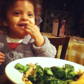
  •  Lola likes to eat veggies
  •  I live in a place infested (beautified by!) graffiti artists. 
If you're into that kind of thing then you'll LOVE my Instagr.am feed
If you just think I need a better camera (or an actual iPhone) and some perspective leave a comment here because you just might be my new best friend.

Some detail shots:
Had to tell myself: PUT THOSE STICKERS DOWN- they're so versatile!
Basically Bare acrylic cog- can you see it?
Freaking AWESOME! I wish they had smaller ones. 
Finally used that OA Tin Pin- LOVE!
GRATUITOUS CUTE BABY SHOT!
A plate of broccoli (Instagr.am)
Gotta love it.
MuChoS SmOoChEs!
Michelle
Saturday, February 11, 2012

Thank god it's... saturday?

OOPS! I was supposed to post this yesterday since I know most people are out doing fun things on Saturday.
I saw a BEAUTIFUL page on Scrapbook.com by Jolaine Frias and I simply HAD to lift it.
By "lift" I mean take an idea I loved in her layout and try it for myself. I wouldn't try to copy the whole layout- she's too fabulous- it would take WEEKS of learning new techniques.. now that I mention it- maybe I should go ahead and try it.

Here's my version:
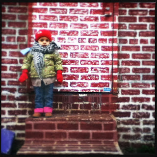
We were just walking around the neighborhood when I started seeing all these awesome messages.  It was like the walls were telling me to CHILLAX- others are feeling it too. I used a mist tube taping technique I picked up while watching a Swissgirl Designs video- can't believe it took that long for me to "get it".
Materials: Bazzill paper, Crafter's Workshop brick wall 6 by 6 template, Prima brick stamp, American Crafts Rootbeer Thickers, Colorbok glitter arrows, Tattered Angels Sunflower, October Afternoon Buttermilk mist, Studio Calico Schoolhouse, Atmosphere and Calico White mists, Hero Arts alpha stamps, Red Stickles, Smash Polka Dot tape
What I loved about Jolaine's differently styled page (which is also up on her blog) is her gorgeous tone on tone brick stamping. It's a small detail in the layout but I really liked how controlled and thoughtful the design is. The pattern is placed in just the right places to add visual complexity to an already fabulous layout but without adding visual clutter- a trick I haven't quite gotten the hand of yet.

Here are a couple of close ups:
I love Lola's pose! I think these are too blurry- I took them in late afternoon light.
I'll have to reshoot this again but I was so excited I had  to share! I used a Crafter's
Workshop brick template I've had for over 6 months- why did I wait that long?
The alphas started as brown glitter. I added some red Stickles and I really like the effect.
The red gets depth from the brown underneath and the edges stay dark for extra pop.
I'll have to keep that in mind for my next Thicker alteration.
This page came together rather quickly after I printed the photos and penned the brick pattern. I see I'm getting a little more abstract in my work- a little more minimalist. I like this new direction- it feels authentic to me.

GRATUITOUS CUTE BABY SHOT!!!!
Lola likes Broccoli- a LOT! I will keep encouraging this wonderful eating habit-
it keeps me from raiding the potato chips.
MuChOs SmOoChEs!
Michelle