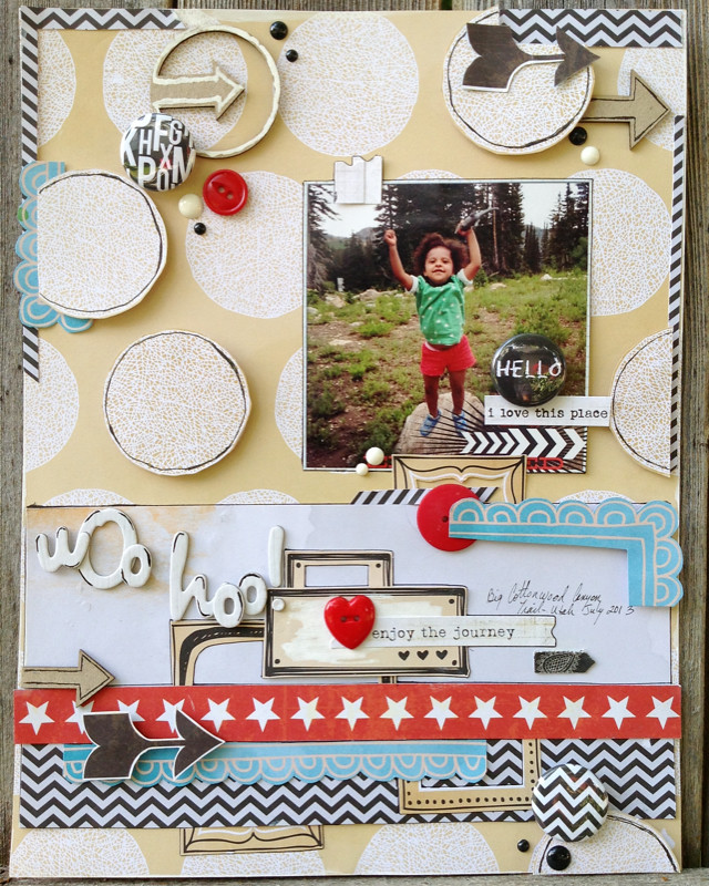
Today I want to share a page I made for A Flair For Buttons.
I started with the fantastic circles pattern in the background and quickly decided I liked this pattern with the b/w chevron. After that is was just about playing around with window and pop out details.
The photo in this page is a good reminder- having fancy filter apps to add titles and effects on your photos is great but if your original image was already low rez, adding effects to the image will only highlight it's lack of focus.
Since I'm working without my beloved Mac I have no choice but to take images with my ipod and print to Walgreens.
It's an awful substitute to printing images at home where I tweak everything in photoshop but that's how I'll have to work for the foreseeable future.
 |
| I'm finding great American Crafts product bargains at TJ Maxx (Amy Tangerine, Studio Calico, Dear Lizzy) and Tuesday Morning (Crate Paper and Cosmo Crickett) |
 |
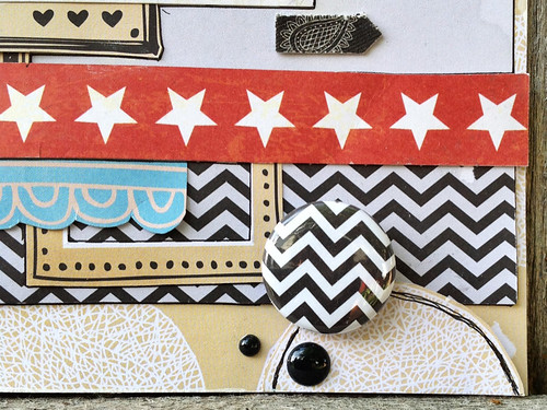
| Picking flair buttons for this page was easy! Deciding which ones to keep and which ones to use somewhere else was hard. |
Please swing by the Flair buttons blog and check out Ashley's fantastic series: "No More Floating Flair" where she talks about different ways to incorporate flair into your layouts without making them look totes random (a particular issue with my pages- lol!)
Have a great weekend!
Michelle

Love the arrows, stars and circles on this page.
ReplyDeleteLOVE this!!
ReplyDeleteLOVE your layout, of course! Your use of patterns and shapes is inspiring! Also - thanks for the super sweet shout-out :)
ReplyDelete