I was flying high on scrappy mojo last weekend and experimented with both my Scrap FX stencils and my Pima chalk inks.
Last week readers and fellow scrappers Scraps and Scarlett BOTH wrote in to repeat advice they had given me before:
When working with wet media it's best to use heavy weight paper and spray the paper down a bit before you start.
Ok advice taken.
Not really.
I decided to use chalk ink with my FABULOUS Scrap FX Engineering stencil because I didn't want to mess with mist spray.
Mists get everywhere and I wanted to work on a tv tray table while watching Sons of Anarchy.
(I'm totally addicted!)
I recently bought 2 pieces of luscious 8x11 double weight water color paper to play with.
I just love all the nooks and crannies!
I got to work and this is the resulting page:
Here how it went down step by step:
- Prima Attic Dust chalk ink over Scrap FX stencil layer.
- Gel pen outline since the ink got under the stencil and pooled all over the place.
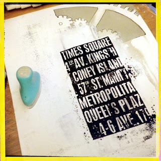
- 4 inch Tim Holtz subway poster stamp and black Prima ink.
- PROBLEM!!! Chalk ink stamped image is not good on the uneven water color paper
- White gesso layer to cover the ugly stamp
 |
| PROBLEM!!! Chalk ink is water based (water soluble) so it streaked the gesso. DARN! MESS!But wait... this is... pretty!!! |
- Spray the front and back of the page with Tattered Angels "Iridescent Gold" which I almost threw out because it's pretty much invisible. The thing is... that's a GOOD thing if you are layering multi media work. The gold added a nice sheen to the paper.
- PROBLEM gray stencil ink started running down the page RED ALERT RED ALERT
- Decided to use that as an effect and added some Studio Calico Opaque White spray mist to make the ink run even more.
- Let dry for 30 minutes and try to distract myself.
- Try to speed things up with heating tool but that cracks the gesso- a look I hate and refuse to include in my pages.
- Emboss the Tim Holtz stamp in black.
 |
| PROBLEM- the bottom of the paper wasn't fully dry so the embossing powder stuck at the bottom. But wait.. New York City subway- that texture IS PERFECT!!! |
- Decided this was a grungy page and went with it. FORCED myself to relax. It's. just. paper.
- Chose gear and cog chipboard designs to go with the "Steampunk" look.
- Added red circles from Basic Grey's "Hello!" line to give some contrast and focus to the page
- Called it a friggin day
Where did my "What I learned this week" logo go?
It got me nowhere so I decided to design something a little less chessy looking.
Hope you have a great day folks- off to work I go!
MuChOs SmOoChEs!
Michelle


Such a fun post and AWESOME layout!!!
ReplyDeleteU rocked this!!!
ReplyDeleteLOVE!!! And keep finding myself laughing when reading your post, your experiences during the process. The result ROCKS!! Even though your left with "not learning anything" LOL(I'm sure you will remember some of it)
ReplyDeleteWhen a mistake become art!! Absolutely amazing!!
ReplyDeleteI loved reading this post, it made me realise we all have the same issues from time to time, love the end result though.
ReplyDeleteThat's the beauty of mixed media. Unexpected results. Heart palpitations when things look disastrous. Victory dance when the end result looks super artsy..*high fives*. I love your page. :)
ReplyDeleteSat here literally laughing at the screen. You make me feel better about the way I work Michelle because it's this way ALL the time.
ReplyDeleteI love this page you have somehow managed to combine clean lines with a droolsome grunge. It's gorgeous!
I think you are awesome!
ReplyDeleteBrilliant...see, there are no mistakes in scrapbooking! Love this layout, the colours, the grungy look...simply fab! :)
ReplyDeleteOk, even if things didn't go quite as planned, this turned out FAB! Love every inch of this funky, grungy work of art!!
ReplyDeleteОбалдеть!!!!!! Это очень круто! И спасибо за описание процесса! Аааааа, прям тащусь))))
ReplyDelete