Friday, April 26, 2013

Inspiration Friday- Art happens.

HIYA!

This week went by so quickly I didn't make a thing.
Thursday was filled with ALL interesting things!

I've had a visit to The New Museum Of Contemporary Art in my "to do" list for over two years.
The have a gorgeous new building that looks like stacked corrugated steel blocks.
See? SO PRETTY! Also? Giant metal rose! What's not to love?

I love modern, challenging and contemporary art museums.
The exhibit "NYC1993: Experimental Jet Set, Trash and No star" was SO not time to visit this museum on a whim.
Very little of what's hanging in the galleries is ok to show here.
No, really.
Crude, shock baiting, obvious and irrelevant are all words that come to mind in regards to what's on exhibit now.

I am an open-minded person who enjoys having the rug pulled out from under her expectations.
But even for me, a good time does NOT include visiting a space where people stare and smirk at a "mixed media sculpture" of a man, a child and a goat.
That move.
Luridly.
Yes- feel free to imagine the very worst.

Who. Buys. This. Stuff?
More importantly, WHY?

I mean, yes, art is MORE than just pretty pictures to match your furniture.
Art is about making you see things in a new way.
It's about opening unexpected doors to new ideas and view points.
For me, art is NOT about beating the viewer over the head with the terms
SEXISM! RACISM! HOMOPHOBIA! FEMALE DISEMPOWERMENT and SUFFERING!

If I wanted to experience obvious interpretations of these societal ills I would walk down the street like I always do, eyes open.

When I see art, I want to be transported.
This exhibit took me straight to a dark place and left me there saying
"Ok. Never coming back here again."

Yet, there was another aspect to this.
As we trudged from gallery to gallery blocking Lola from the worst of the "art"
PS- that's not something I do. I would rather deal with the following:
"What is THAT?"
"That is a set of teeth jutting up and out of a chair." (See? Told you! BANANAS!)
But the husband wasn't HAVING IT!
He left and took the kiddo with him to the food court where a thousand tiny origami paper cranes flew.
Ahhh... art.
Transcendent and perfectly normal all at once.

In my feeble defense, I had no idea WHAT the museum was showing.
It was free thursday and we were curious to see the inside of the place.
SO not what you do.
SO. NOT. !!!
Always, ALWAYS check the museum website or stick to The Met.
The statues in The Met are naked but DO NOT MOVE.

I was feeling all kinds of mixed up.
Here I was grossed out by this spastic display of creative desperation
All the while getting a chance to relive my past.
Not a past of violence or political disempowerment but a past of youthful creativity and hope.

In 1993 I was a Freshman college major participating in an exciting program called Yo-Tv.
We got to make the exhibit video for the Whitney Museum's Biennial.

I met many of the artists in this exhibit 20 years ago when I was pretty impressionable but even THEN I knew the work was lacking.

Here are a few of the installations or exhibits I thought flew past their social ills moorings and spoke to the soul about truth not just capital lettered negativity.
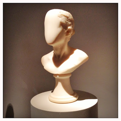
Janine Antoni's "Lick and Lather".
Chocolate  or soap busts that have been licked or lathered.
The results are rather eerie and beautiful.
We can talk for HOURS about female ideations of beauty and empowerment or
we can admire this set of 20 busts that fills the room with the scent of chocolate. 
Didn't get the name of this artist but I loved the interpretation of words so hot they
burned the letters off the page. What a beautiful way to capture feelings and ideas about
sexuality, privacy and knowledge without thrusting body parts my direction. (EWW!)
No artist info- sorry! This was a huge room with wall paper, an orange rug,
lights hanging from the ceiling and music. It was pretty and I wanted a great picture
then the guard yelled at me for getting too close to the installation. So I hid him behind the light.
A photo of a  mirror. Cast your vote for what this stands for. Yeah pretty obvious.
I loved it anyway. It was printed beautifully by Zoe Leonard- an artist I got to meet
and whom I found especially insightful, inspiring and down to earth. 
Pepon Osorio. This two room installation showing all the stereotypical objects d'art that
Caribbean Latinos of a certain generation and dare I say, economic status, tended to fill their homes with.
On the floor is a dead body (a fake one- this is supposed to be a movie set).
I identified with and was repulsed by this but I interviewed this artist for the Biennial video.
I thought the work  didn't make a lick of sense but I liked that he was able to explain himself to
19 year old me plainly and without that tone grown ups get with ignorant know-it-all teenagers.

Uhmmm- enough of THAT.

The New Museum changes exhibits frequently so maybe I'll see something interesting next time- if I ever bother visiting gain.

Onto the more accessible art!
Thursday morning we lined up and waited an hour to get our portraits taken for the InsideOut NYC Project.
If you are near 46 street and Times Square and have a few hours to kill I suggest you line up.
It's free.
You go to the back of a black and white polka dot truck to sit for 6 seconds and get a photo taken- no backsies!
You can then choose to take the resulting poster home or let the crew paste it to the ground in front of the TKTS booth.
This was total AWESOME SAUCE.
We are going again because this happened:
Beware of "funny" faces and distracted toddlers. :)
If Lola had looked in the general direction of the camera, this would have come home with us.
I don't enjoy the sight of my daughter's enlarged nostrils.

Have a great weekend folks!
Michelle

Friday, April 19, 2013

Friday photo Inspiration- store displays and ripped posters.

Hiya!

This is going up late because I'm totally riveted by the developing news in Boston.

The Breaking News coverage by Fox News 5 is a complete mess.


They pulled a news intern (Explanation: "She's from Russia") presumably because she would be an expert on Chechniya. (???!!!)

She's from the former Solviet Republic of Georgia and refused to join in their truthiness quest.


I changed the channel when they declared the brothers were illegal immigrants (untrue and reported correctly everywhere else- OOOPS!).

AnYwAy..
Here are my inspiration photos from this week's series of aimless inspiration walks.
I found the KEUUTE Allegria Boutique here in Williamsburg.

I didn't buy a thing.
I'm not the kind of Mama who pays 45 dollars for kid sized jelly shoes (I can get them for 5 bucks in Chinatown!) but if you are, AWESOME!
Go here! Be happy!

Felt embroidery hoops at Allegria Boutique on North 3rd.
This place is a DYI children's crafts fairyland. Swing by and be inspired! 
Pudgy owls!!! I loved the wall paper, the sofas- everything in this shop!
Paper houses- wrapping paper, candy, dime store jewels, cupcake cups- adorable!
I also swung by Anthropologie- the display staff in this store deserve art awards- really.
Great stuff on sale this week.
I bought one of those a green ceramic strawberry basket for 9 dollars- half price.
Giant wall display at least 8 feet across. LOVE the wall color!

Coral, turquoise, pink and woodgrain triangles on a mustard yellow
cracked plaster background- this HAS to be my next page!
Giant water color wire and paper flowers- gorgeous!
And my last series- ripped paper.
I love the look!
Keith Haring Brooklyn Museum exhibit from last year.
This BLEW MY MIND. Someone had the forethought
 to rip this chalk drawing off a subway wall and frame it as ART!
Can you BELIEVE IT? I . LOVE. New York!!!
I believe Pterodactyl Ptarty is a band. Excuse my ignorance but I have no clue.
I love the blocking here.
With a color palette change this would make a SLAMMING scrapbook page!
Not a poster but I love the neon pink on blue color.
Have a great weekend!
Stay positive!

Michelle

Thursday, April 18, 2013

30 minute scrapbook page- maple wood veneer, stickers and plastic doilies.

Hiya!
I wanted to share this super quick page today because it's gotten lots of positive feedback in my instagram feed and via Twitter. (yay!)

I made this page in 20 to 30 minutes- more than half the time was spent putting the little white gel pen dots
 on that Scrap FX scribble frame! I used some Maple wood veneer and I must admit I was scared
 to paint it like I was planning- I love the idea of putting neon on these but without any experience
 I was worried about bleeding. The bottom doily is actually covering a stamp that went completely awry.

I've been talking to a lot of folks lately and hearing the same thing
"I don't read blogs."
These are young hip people who sited Reddit and Tumblr as their primary sources for info.
Neither are very good for my purposes so I am at a loss.

I love writing but most people don't have the time or inclination to read.
Have you found the same happening over at yours?

Materials: Glitz design film strip, A Flair For Buttons flat back pin,  frame from Scrap FX,
star clip from American Crafts for Studio Calico, stright pins from Maya Road. Plastic doilies from
The Chip Chop shop- a favorite Etsy store that is currently closed- sorry guys.
I love and really appreciate the lurkers, the commenters and the true believers who constantly cheer on my work and my constant blather- thank you so much!!!

Michelle

Wednesday, April 17, 2013

Fun with Maya Road!

Hello and happy wednesday folks!

It's been a pretty sombre week.
I took monday off in deference to the horrific events in Boston.
I will be making a page and showing it here on friday but basically this is a moment to pause and reflect-
to be introspective and respectful-
to cherish your loved ones and give whatever you can-
a moment to spread the light.

Talking scrap, it's been a busy couple of weeks for me.

I was trying to come up with two SPECTACULAR scrapbook pages for my Maya Road Guest designer application.

By "spectacular" I mean pages that do the product justice and showcase my ability to use MR products especially straight pins, stamps, mist droplets and woodgrain.

Without further ado here are the pages I came up with:
I found this print from my senior year in college- 1997! I spent my last semester in California and I remember how self conscious I was about my body. This was the only time I wore a two piece swim suit while there! Now I look at those photos and marvel at how thin and FABULOUS I was. I intended to use my Maya Road ledger stamps but when I saw the pure white rosettes I decided to go with a monochrome arrangement. I will be making another page for SURE!

Rosettes- I love them. I make mine using the Martha Stewart scoring board,
zip dry and mini paper clips to secure the ends while the glue dries.
Stapling also works but it's hard to staple smaller ones like these.

I could photograph the Empire State Building every day for a year and never get the same photo twice. This is one of my favorite things about living in Brooklyn hands down.
Here I was having fun with the indigo color trend and my Maya Road straight pins and wood buttons- can't have enough of either.

Once I stamped the background everything else just fell right into place- I LOVE it when that happens!
I'm keeping my fingers crossed.
The calibre of talent that is out there is amazing.
Good luck everyone!
I hope to join you in a week or so. (toes are now crossed as well!!)

Michelle


Thursday, April 11, 2013

Scrap Fx April Favorites Mini Hop!

Welcome to the Scrap Fx design team mini hop for April!
This month's mini hop theme is:
Favorite things!


Every month different members of the Scrap FX design team will be getting together to show you different ways to use chipboard in your paper crafts.

Favorites? Ombre. Yellow. cameras. Sunrays.
Summer. Sassafras Lass. Stitching. Misting.
The blog line up is:

Michelle- My Analog Life- you are here- HIYA!

For my project I featured some of my personal favorites:
  • Favorite paper brand: Sassafras Lass paper in a black and white stripe pattern. I love black and white stripes so much I have a divider just for them in my paper cubby. 
  • Favorite color: yellow- it's cheerful and screams, "SUMMER!" my favorite season
  • Favorite trend: sunray patterns and stitching
  • Favorite technique: ombre effect using a gesso base and mist paints.
  • Favorite page theme: my daughter Lola in an everyday photo- I don't scrap holidays often
  • Favorite Scrap FX wordlet chipboard: The Words of Love piece because the words are still attached to their frame. I can snip the words out and use them individually in my Project Life album or as one piece for major impact on a page.

I started with some scraps from a Studio Calico print and pushed them around the page for quite a while.
Then I realized the scraps should resemble a sunray pattern. I painted the chipboard in an ombre pattern- something I've been meaning to do for months now. ONLY after I realized I was out of yellow Amy Tangerine floss did I think to use orange jute cord to stitch the sun. I LOVE the result! It's organic design process took three days to accomplish but I felt none of the stress/pressure I usually feel when making a page.
I used the following Scrap Fx chipboard items here:
  • On tour/itinerary/sighseeing pack model number 2010180
  • Words of love model number 2013050
So this journaling makes me laugh- did I really just journal about sweat???
My thinking was "The photos are pretty abstract here- let me add some meaning."
This was the result. I tried getting the traditional smily toddler shot, promise!
Lola rarely co-operates with my camera antics .
I got tired of yelling HI! OO LOOKY HERE! HEY PRETTY PRETTY GIRL!! SMILE!
 This type of photo is more interesting anyway. I hope she feels the same way.
If anything I can blame her for not looking up ever EVER when I was trying to get a cute shot.
Now hop along to the Scrap FX Blog and...

Have a GREAT weekend!!
Michelle
Tuesday, April 9, 2013

Blast from the past Tuesday- Learning from mistakes and using fabric scraps

Hello!

I was wondering where my time went this weekend.
I thought I had everything in hand.
Suddenly it's monday, I have to write a "What I Learned This Week" post and realized...
I have nothing to write about.

So today I'll share a project I made for a Creative Keepsakes article 2 years ago on using fabric on a layout.
The project never made the magazine for obvious technical issues.
I still like the ideas I had for this simple page but leaving the crease
on the fabric was a big mistake. Also? No journaling.
Normally I wouldn't add any because the story, my daughter playing in the park,  is obvious
but publish worthy pages need a good story- I needed to dig deeper and write it out.
Here I tried to add dynamism to the design with the photos but
the bright colors are distracting. The eye keeps focusing on that red rick rack.
I should have and added the rick rack horizontally and given more space to the
white grid for balance. 
The big idea behind this 2 page spread was that I used fabric from the dress my daughter had on in the photos since the dress no longer fit and I really loved the cheerful pattern.

I could have journaled about that!
That's the story!
One of the many reasons I ran out of scrap time.
We were having actual outside fun in 70 degree weather.
Oh the sacrifice!
Have a great week!
Michelle

Friday, April 5, 2013

Friday inspiration- Nolita Photo walk

Hello folks!

This week's photo inspiration post was brought to you by a recent walk through Soho and Nolita.
Hot little heavens for visual stimulation.
That sounds rather indecent.
If I get lucky I get to stand out front when I'm at work and make samples.
The idea is to try to capture a customer's attention and get them to see how they can
use the stamps and other products they buy while at the store.
I made both these cards in under 20 minutes using scraps I had on hand.
I rarely get to pick the colors I love most but a little orange helps both grey and teal pop.
Martha Stewart butterfly stickers, Studio Calico mist, Paper Source card stock and stamps. 
I just mean that there are so many museums and shops all close together that the streets are popping with ideas for the open minded crafter.
The ideas can sit in your brain for weeks when suddenly BOOM! an original page appears.
At least that how it works for me.

Case in point:
3 foot tall at marquee at sign.
I REALLY want to make one of these!
Big Boy gets several make overs.
This gorgeous bag hanging in a tiny shop in Nolita.
I didn't even try to go in and inquire how much it was.
The "feathers" are delicately curved sequins.
"Life isn't tragic, Love is being ignored."
Why this is fabulous: 1. They used Puffy
scrapbook stickers and brads. 2. Hello giant scrapbook layout!
3.This was a store window display.  4. It was over 6 feet wide.
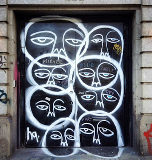
Faces layered on top of each other.
This would make a great textile print.
Another mural I caught while the artists were still working.
No I didn't speak to them. Yes I regret it.
Wheat paste posters. 

Also?
I found a gif making app!
All you have to do is take a series of photos and open them in GifMill to animate- super easy to use.
The only drawback is that this is the final size of the file- it's crazy small!
Also- these won't animate of Facebook so you can't torture your friends with them (darn!)
Still...
Just imagine the tutorial possibilities!

Have a greet weekend. 
Go on and make something awesome!
Michelle

Thursday, April 4, 2013

Hot Topic: Organizing your ever expanding stash for Project Life

Hello!

I've been having "fun" (undergoing self imposed torture) trying to organize my scrapbook supplies.
I suffer from the delusion that items are easier to remember and retrieve that way.
So far I'm failing miserably due to lack of space and an inability to decide how to organize.

My first attempt at paper organization is a compromise.
I am using manufacturer, favorite color and pattern categories.

I found a plastic bin that was 13 inches wide and three feet long.
Yes I have enough paper to fill it up entirely.
Yes I am aware this might be a problem.
At least now all the paper is in one place so I can retrieve it "faster" so far that just means
I leave paper everywhere as I try to decide which prints I want to use most
So far I have the following categories:

  • grid
  • woodgrain
  • red
  • yellow
  • neutral (kraft, black, grey and white based papers)
  • Sassafras Lass
  • Crate Paper
  • vellum
  • cardstock

This all came about after a conversation I had several months ago with other scrapbookers right in the comments section of this very blog.
I made the bold statement that organizing paper into ROYGBIV is too time consuming and obsessive.

Then a favorite scrappy friend admitted she loves playing around by organizing her stash and that it it's her favorite way to get page inspiration.

Well alrighty then. I'll give it a go.
2x3 inserts- oh so cute!
And SO time consuming when you have to cut them out yourself.
I spent two hours shifting paper from one folder to another and admiring prints.
Not the best use of my time.
It's good to review what I have but the basic problem- too much crap- hasn't been solved.

Also- the first 4 boxes finally made their way over to Materials For The Arts- a great local charity that does just as the title says.

Enough yapping.
Here are my first 2 Project Life pages for 2013.
This took 3 days. Deciding what papers to use,  cutting the cards and printing the photos this project is a MAJOR challenge. Maybe you can tell- I had a printer mishap. The black cartridge was almost done but still had enough to print 1 last page. I used the photos anyway. Getting a dedicated Project Life kit is a great idea but then my PL will look like other people's- it's hard enough to get bloggy readers to pay attention as it is! One thing is certain- I LOVE looking at the final pages! It's so great to see these little bits of life all strung together! Yes it's a ROYAL PAIN but I love the final product.
I like this spread more- more color, more fun with Scrap Fx chipboard, and the colors matched a bit more since I stuck to Glitz Color Me Happy. I'm about to tackle another 2 spreads- think I'll just stick to 2 12x12 pages cut into pocket size- it might be a bit boring but you have to get into the swing of things with this type of project.
So- how do you organize your scrap space?

Thanks for stopping by!
Michelle